Showing posts with label sinful colors. Show all posts

Sunday, July 13, 2014

REVIEW of Sinful Colors Professional Nail Colour in 1199 Song of Summer With SWATCHES

Hi chickens,
I know I've been letting the days go by without posting for a while. Sorry about that! I've been working on some non-blog related things, and probably doing more online shopping than I should be. Damn those fourth of July sales! Anyway, I'm back with a review of Sinful Colors Song of Summer which I actually picked up ages ago when I still visited the drugstore on a regular basis. It seemed a shame to let summer go by without trying it out so that's what I did.

Out of curiosity, what's your song of summer? I was thinking it would come from the new Lana del Ray album but while I liked it, nothing really jumped out at me. And even though I like Lights Out more than I liked Human Again nothing on it sounds as good as the best Ingrid Michaelson songs from her earlier albums. Alone Again by Betty Who has been my jam lately but I was hoping for more of a mindless pop song to associate with summer 2014. Moving on...

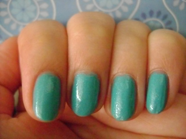
Color: Sinful Colors Song of Summer is a light green creme polish. It's not quite light enough to be a pastel as the yellow in it makes it a brighter spring green. But it also isn't an in your face aggressive color. It reminds me of the artificial shade of green that I associate with cheap pistachio gelato but just a bit dustier and more muted. The photos are color accurate so you don't need me blathering on about it.
Formula: The formula was a little thick. It wasn't horrible and gloopy, it was just noticeably on the thicker side.
Application: The first coat applied smoothly. As the formula is a little thick you might have to even out the polish a little with the brush but I would be careful about doing that as it doesn't even out perfectly. There's no drag but it's just tricky to even out the polish without the brush creating ridges in the layer of polish you just painted on. The second coat also went on smoothly. This polish is very manageable. I only ran into problems trying to even out the polish but even then, it wasn't too much of a hassle. In a pinch, you could get away with two coats but a light test revealed that the polish still wasn't opaque so I did three to achieve full opacity.
Wear: I wore this polish for six days and experienced very minimal wear in that time. I only removed this polish because I was doing someone else's nails without gloves and messed up my manicure with polish remover.

CONCLUSION: I would recommend this polish. It doesn't apply perfectly but it's totally manageable if you've got good control and the formula is pretty good for a lighter creme polish. The price is right with Sinful Colors polishes only costing a dollar or two depending on when and where you purchase them and if there any sales or store rewards you can apply. I would probably chose this polish over the similar Essie and Zoya shades that I have in my collection. If you'd like me to do a comparison to those polishes and maybe also OPI Gargantuan Green Grape and Butter London Bossy Boots, let me know in the comments.
Cat is a participant in the Amazon Services LLC Associates Program, an affiliate advertising program designed to provide a means for sites to earn advertising fees by advertising and linking to amazon.com. If you would like to help support this site, please consider making your next purchase at amazon.com through the links on my page. I will get a small percentage of anything you purchase through one of my links at no extra cost to you.

SWATCHES

Monday, June 16, 2014

Maybelline Frozen Over Sinful Colors Cinderella Comparison

Hello my little ice princesses,

See what I did there? Yeah, I know. I'm very clever. I have some downtime at the moment so it's finally time to fulfill the request I got way back in April to do a comparison between Maybelline Color Show Nail Lacquer in 315 Frozen Over and Sinful Colors Professional Nail Enamel in 1106 Cinderella. If you'd like to read more in depth reviews of each polish, I've provided links to my original reviews.

For this comparison, I applied four coats of Maybelline Frozen Over to the nail of my pointer finger and four coats of Sinful Colors Cinderella to the nail of my middle finger. With Frozen Over, I found that all four coats went on smoothly but a bit unevenly, particularly with the first coat. I even out the polish a bit but not much as I was trying to not overwork it. With Cinderella, all four coats also went on smoothly without any drag. However, with the first coat of polish, you could see a clear difference between Cinderella and Frozen Over. Cinderella is considerably less opaque. There was barely any blue pigment deposited with the first coat of Cinderella, almost as though I was using a sheer nude polish that had been tinted blue instead of a regular creme. At four coats, neither polish was opaque. The color of the two polishes is similar but not identical. The Sinful Colors is a more subdued powdery, dusty blue while the Maybelline polish is brighter blue that appears more aqua (blue-green) next to the Sinful Colors polish. It's subtle if you aren't looking for it but there is definitely a difference between the two polishes. The Maybelline polish was clearly more opaque but patchy while the Sinful Colors polish was less opaque but more even. The flaky/shimmer particles in both polishes look identical to me. The particles are both a shimmery pale blue that picks up glints of pink when the light hits them.

I have read other reviews of these polishes that advise you to use them as top coats. Thus, for my ring finger and pinky, I applied three coats of Sephora by OPI Havana Dreams and then applied a thick coat of Maybelline Frozen Over to my ring fingernail and a thick coat of Sinful Colors Cinderella to my pinky fingernail. You do get a different look using these polishes on their own vs. using them as top coats. However, if opacity is a big concern, this is a way to wear these polishes without having to worry about applying a million coats of polish. The flaky shimmer is a little less pronounced when you are just using these polishes as top coats. Since neither polish provides a ton of pigment in one coat, they're mainly adding shimmer and so they provide a fairly identical effect when used as a top coat.


  Cat is a participant in the Amazon Services LLC Associates Program, an affiliate advertising program designed to provide a means for sites to earn advertising fees by advertising and linking to amazon.com. If you would like to help support this site, please consider making your next purchase at amazon.com through the links on my page. I will get a small percentage of anything you purchase through one of my links at no extra cost to you.

CONCLUSION: You'll have to decide for yourself what's important to you. Sinful Colors Cinderella applies more evenly but is less opaque. Maybelline Frozen Over applies less evenly and more patchy but it offers greater opacity. Both formulas are manageable. If you only want to use these polishes as top coats then they look identical, so I would go with whichever one is cheaper where you happen to be shopping. Personally, I would pick the Sinful Colors polish because I like the color a little more, it's cheaper where I live, and it's easier for me to fix the opacity than the unevenness of a polish.

Friday, October 25, 2013

REVIEW of Sinful Colors Polish in Snake It Out With SWATCHES

Hello my little serpents,


I deleted the original post from the first time I tried this polish but I remember that things were not great. However, a few months later, my opinion of Sinful Colors Snake It Out has improved. Let's just jump right into the review, shall we?

Color: Sinful Colors Snake It Out is a shimmery gold magnetic polish. The polish is a cool-toned lighter gold that almost has a touch of green and bronze to it. When I first saw the collection a few months ago at Rite Aid, this is the color that stood out to me as being the most snake-like. Even though this is a magnetic polish, I think you could easily wear this without the magnetic design. However, I do like the depth that the design creates, though it's less of a snakeskin pattern and more of a basic criss cross pattern. The color recedes from the lines so they appear to be almost white and the color gradually fades back in to the center of each square where the color is more concentrated. Depending on the lighting, sometimes this polish looks like a lighter gold, sometimes it looks more bronze-y, and sometimes it has a bit of a green tinge. It's not a duochrome but it looks different under different lighting conditions.
Formula: When I first tried this polish I found it very thick but this time the formula seemed normal. It wasn't noticeably thick or thin. When I first tried this polish it was around about the same time last year so it's not like the heat of the room I was working in should have affected the consistency of the polish. It's a mystery. I should note that this polish smelled rather awful. I know polishes usually don't smell great (unless they're scented) and I don't recommend smelling polishes anyway as even if they're "3 Free" or "5 Free" they're still probably full of chemicals you shouldn't be inhaling. Still, the scent was bad enough for me to notice it but thankfully it was not a strong scent at a distance and the smell faded quickly once the polish was dry.
Application: Application was pretty good. It was definitely an improvement from the last time I tried this polish, which was a complete mess. The polish was smooth and easy to work with. The shimmer made the brushstrokes more noticeable but I didn't have any issues with dragging or being unable to even out the polish. I used three coats to get this polish to full opacity. Now, for the magnet. As with all of the other magnetic polishes, the way this works is that you are supposed to apply your bottom layer(s) of polish and then apply one thick coat of polish and very quickly hold the magnet that comes with the polish over the nail for the recommended amount of time so a pattern appears in the wet polish. I found it a bit tricky to avoid touching the magnet to the nail while still holding it close enough to have an effect on the polish. I messed up the nail on my pointer finger a bit by touching the magnet to the nail. Aside from that, this time I didn't have an issue getting the pattern to appear. It wasn't very dramatic but it was definitely there. Though for whatever reason, it seemed to work better on my left hand (which I photographed) than on my right hand. I think this design might work better on longer nails as the pattern is on the larger side and you will get more of an effect if your nails are longer. I tried this look out on a nail wheel before I used it on my nails and I think the increased surface area helps you get a better impression of the design.
Wear: This is very important. Top coat blurs the design. You will still be able to tell that this isn't an ordinary polish but the criss cross pattern will no longer be distinct. I avoided using top coat on one finger to see how it would hold up. While the polish did look more worn and while I did experience tip wear, I think you could get away with wearing this polish without top coat for a few days. It's worth it if you want to really see the design.

CONCLUSION: I would recommend this polish but I'm not recommending it enthusiastically. I think it's fine as a regular polish, though at five or six dollars, it's a bit more expensive than a regular Sinful Colors polish and I'm not sure the color is worth it. As a magnetic polish, it's OK. If you really want to see the design you should probably wear it without top coat and if you have more issues with chipping than I do, you might want to skip this polish. I'm not unhappy to have it in my collection but I don't think you need this polish.

SWATCHES

Friday, May 10, 2013

REVIEW of Sinful Colors Polish in Sweet Dreams With SWATCHES

Hi sugarplums,


I did not like this polish. I did not like this polish at all. OK, to be fair that's a bit of an exaggeration. I didn't love the color of this polish but I was fine with it. But in every other respect, I did not like this polish at all. Sigh... Let's just break it down before I start to get irritated again.

Color: Sweet Dreams is a saturated aqua blue polish. I hesitate to call it a shimmer as it doesn't have the smooth, refined look of most shimmer polishes. This is the tacky, low-end version of shimmer which is just tiny flakes of glitter. It reminds me a lot of the sort of greasy look of Zoya Skylar. You'll see what I mean in the swatches. For whatever reason this polish makes me think of a bad under-the-sea themed prom or a ocean diorama project. There's just something about it that feels cheap and juvenile. The color is strong but it's not really vibrant and more intense on nails than it appears in the bottle. The polish leans pretty green so don't expect a basic blue. I have no idea what they were thinking when they named this polish. It doesn't feel like the nude or pastel polish you might associate with sweet dreams and I'm certain Annie Lennox wouldn't approve either.
Formula: The formula is thick.
Application: This is one of those odd polishes where application is smooth and the brush doesn't drag through the polish but it's very difficult to get thin, even coats. The easiest way to work with it is to paint on thicker coats. I needed 2 coats to get this polish to full opacity.
Wear: I wore this polish for less than 24 hours. I really didn't like it. But as I removed it, it stained by nails a little so that I had to keep going back with nail polish remover to full remove all the blue. And this was using Zoya Remove+ which is stronger than my regular nail polish remover. The polish didn't stain my skin.

CONCLUSION: I would not recommend this polish. The color isn't all that remarkable and the finish makes it unflattering and cheap-looking. The application isn't great either. It's a polish you can work with, but for me it's not one that I want to work with.

SWATCHES 

Friday, March 15, 2013

REVIEW of Sinful Colors Why Not With SWATCHES

Hi chickadees,

It figures that things would have to get worse before they can get better. I have some more bad swatches for you today as it was impossible to get a color accurate photo of this polish. I scoured the web and this is the most color accurate swatch I could find.

http://www.rightonthenail.com/2012/08/sinful-colors-why-not-and-traveling-in.html

However, my reviewing skills aren't impaired so let's begin there.

Color: I've been longing for color this winter and Why Not is a very pretty saturated blue creme polish. It doesn't have enough green to be teal. It reminds me of swatches I've seen of Nails Inc. Baker Street and Essie Butler Please, though I think this polish has a hint of green to it and may not be as bright as those polishes.
Formula: The formula is a little bit watery and runny.
Application: The polish applied a bit streaky with smooth brush strokes. That is, I had no problems with the brush dragging, but it was difficult to get even coverage. I think it was because this is one of those brushes that cause ridges to form in the polish. I needed 3 coats to get this polish opaque because of the balding. I think the formula is manageable but it isn't my favorite. Painting with my nondominant hand, all of the issues were much clearer so I wouldn't recommend this polish for a beginner or anyone who doesn't have good control. If you don't do a clean job you can see every place the brush strokes overlap.
Wear: The polish wore fine without fading but it did stain slightly when I was removing it. It wasn't nearly as bad as the one YSL polish I bought and with a bit more nail polish remover, I managed to take the remaining residue off my nails and skin but I thought it was worth noting as most polishes won't stain your skin and nails when you remove them.

CONCLUSION: If you don't already own a similar color and you really want a cheaper alternative I think the formula is manageable but I would probably recommend paying a few dollars more for a better formula.

SWATCHES (Though these swatches aren't color accurate they'll at least give you an idea of how this polish photographs)

Saturday, August 25, 2012

REVIEW of Sinful Colors Nail Enamel in Firefly

Hello chickadees!

I'm so excited. The new charger for my camera battery came in mail today. As far as I can tell it works, so hopefully I can start writing posts a little more frequently again. This review, however, is one with swatches I've been saving for a while.

Like the other Sinful Colors polishes I've purchased, I bought Firefly because I wanted to see if I liked the color before springing for a similar shade from a more expensive brand. Also, sometimes you're just in the mood to buy some nail polish.

Color: Firefly is a warm yellow polish with a hint of shimmer. The shimmer is more or less apparent depending on the lighting, but in the right lighting it has that lovely effect of glowing from the inside. It provides a nice pop of color on the nails but it isn't super bright. On short nails, it almost gives your nails the look of little corn kernels (more on that later). Indoors, it can become a cooler yellow but it's always a pretty basic color, primary yellow instead of anything really fancy. I thought it would look terrible on me because of the yellow undertones in my skin. It looked better than I expected it to but I still think yellow isn't my color.

Application: It took 3 coats of polish to get it opaque, and 4 coats on the ring finger. I found the paint job smoother than some of the other Sinful Colors polishes I've tried in the past. It was certainly better than Sinful Colors Cinderella. But I still experienced some balding, patchiness, and uneveness. I found that it did help to use thicker coats of polish. When I did my right hand (painting with my useless left hand) late at night, I made kind of a mess of it with a LOT of balding and bubbles. So, my warning is that with this polish you really need to concentrate on doing a good job and having a steady hand. Also, it may help to work in bright light. This is probably not a good polish for newbies or anyone who struggles doing their own nails with good brands like Essie or OPI.

CONCLUSION: I can't recommend the polish based on the formula. Personally, I'm not a fan of yellow polish, but if you like the swatches, I'd say go ahead and give it a try. I actually would consider repurchasing this if/when I run out because it looks fine and I can't see myself paying more for a yellow polish when I don't love the color on me. But for people who really want a good polish, I don't think you'll be happy with this.

LOTS OF SWATCHES

Saturday, June 9, 2012

REVIEW of Sinful Colors Cinderella with SWATCHES

Hi darlings!


I'm not sure how I'm managed to avoid mentioning this at every opportunity, but I am a Disney fanatic. I grew up during the Disney Renaissance and those stories and that music completely informed the development of my critical faculties. That is why I've been hunting down Sinful Colors Cinderella like a maniac from the moment I saw it on Nouveau Cheap. I heard the formula was terrible, goopy and sheer, but the moment I saw swatches and heard the name, I wanted that color. Well, of course they were all right.

Cinderella is a shimmery light blue polish that attempts to capture the magic of Cinderella's ball gown in the animated film. I'm not sure if this was a Disney collaboration but it's pretty clear that was the kind of blue they were going for. Now the coloring of her dress changes throughout the movie, so they could have gone with a demure powder blue, or a deeper cornflower blue, or even a pale blue gray with a ton of sparkle to match that moment when her fairy godmother first transforms her dress. They went with a sheer pale blue with a TON of pink shimmer. The nail polish appears different indoors in dim lighting and outdoors in bright lighting though I couldn't capture the indoor shade. Outdoors, the pale blue does remind me of her dress but it's not really all that special. Indoors, in dim lighting (i.e. at night), the color gets darker, brighter, and more saturated and all of that pink shimmer comes out to the point that the polish looks greasy. Even though the polish is pretty sheer, you'll notice the shimmer in the first coat.

Application was a hassle. I needed four coats of polish to get it opaque and try and fix all the patchiness, though I still couldn't get smooth, even coverage as you can see from the swatches. The polish was watery and gloopy but it wasn't messy to work with. Applying the polish was not the problem, it was how the polish looked on the nail. It was pretty impossible to get even coats.

Conclusion: I think this is a very pretty color but it feels like something Cinderella would have worn before she met her prince (assuming she had the time to do her nails). If you really feel the need to have this polish, it costs about the same as a pack of gum but it might be better to hold out and hope that Essie or O.P.I. do a Disney Princess collaboration with Disney in the future. It's not completely implausible as O.P.I. has already done a collection for the Muppets and Minnie Mouse.

Question: Assuming O.P.I. did a Disney Princess or Disney Villain collection what colors would you love to see? Maybe a shimmery Kissed a Frog Prince for Tiana? A Colors of the Wind duochrome (like Just Spotted the Lizard) for Pocahontas? The easy choice for Belle would be powder blue or yellow like her two dresses in the movie but I'd love if they could somehow capture the colors in Beast's final transformation scene in a glitter or shimmer polish. In such a happy mood right now. :)


  SWATCHES

Wednesday, February 29, 2012

Update and REVIEW of Sinful Colors Nail Polish in 944 Innocent AND Marc Jacobs Daisy Inspired Nail Art


Before we get started, I just want to let you know what's going on with me. I currently have a bunch of Lush reviews I need to work on. I have a lot of products in my makeup kit that I'm still testing out but reviews are coming. I've been scoping out my local drugstores but I don't have anything really exciting to let you know about other than that the Essie Go Overboard collection and some of the Essie Navigate Her collection has made it to my local Duane Reade's. I'm still trying to decide how I feel about Revlon lip butters. I don't love them as much as everyone else. I think they have a kind of pathetic wear time and I'm pretty sure they dry out my lips. But I have a little collection right now and I'm still testing things out.

I was just not loving the way Essie's Go Overboard was looking really dingy and worn out on my nails, especially because I have a performance coming up so I wanted to do something bright and bold before heading into a neutral nail week (I've got an exam). Anyway, I let my dad choose and so I ended up with Sinful Colors Innocent on my nails. I didn't really love it at first. It seemed a little harsh but I'm glad I tried this color and this brand instead of say, the more expensive options from O.P.I. which look about the same to me. It's a very yellow-toned bright green, not quite an acid green or neon green but still pretty attention-grabbing. Application was a little annoying with this product. It reminded me a lot of the Julep nail polishes I tried a while back. The polish was thick and sticky/tacky. When you pulled the brush out of the nail polish it sometimes created "threads" of polish. I slapped on some pretty thick coats and the paint job is definitely not as nice as my usual work. My right hand (dominant...therefore nails painted with non-dominant hand) looks awful (in my opinion) up close. The good news is this polish is super opaque. It was almost completely opaque on the first coat and definitely opaque in two. And even with the problems, I feel like this is a great trial color if you're not sure if this would work for you.

UPDATE: I got my nails done today. A rare splurge for me but the mani/pedi deal is great and even though I inevitably find I could do a better job with the manicure, it saves me the hassle of removing old polish which is my least favorite part of the entire nail polish experience. Anyway, even though she had a much easier time removing the polish that I did with Sinful Colors Last Chance, it was clear that even this light color had stained my nails and it took a few attempts to fully remove all the color/staining. I'm not sure if this is a signature of the Sinful Colors brand. I used to use a shimmery/frosty white polish from them in the past and I never had problems with it but that was obviously white so it would be hard for it to stain nails. This might just be a quality of the cremes, or the darker/brighter colors, or all Sinful Colors polishes might stain your nails. I'm probably going to take a break from this brand after I use the bottle of Why Not I already purchased...or until I locate Cinderella which is just too gorgeous of a Disney inspired Cinderella blue shade to pass up.

SWATCHES


Saturday, February 18, 2012

REVIEW of Sinful Colors Nail Polish in 948 Last Chance SWATCHES


Hello darlings!

I have a treat for you today. A gorgeous dark green creme nail polish for $1.99. How? Why? Because I took a break from Essie and O.P.I. and on a whim, I purchased this from Duane Reade and I'm so happy I did. It's my belief that if you're unsure about a product, especially a particularly color or fashionable trend, you should go for a low-end, cheaper version first before springing for a more expensive version you might end up hating. Well, I now know I like dark green cremes but I might just stick to this Sinful Colors version. It applied much better than I was expecting after that whole Wet n' Wild Spoiled nail polish fiasco. It was a touch watery. It was very pigmented, don't get me wrong. Opaque in 2 coats. I only used three because I'm a perfectionist and needed to fix the edges before taking pictures. It looks gorgeous. It evens out perfectly silky and smooth and has the kind of depth of color that makes you want to dive into it. I wish it could have been a teensy bit less watery but that's a minor complaint for something that's 1/4 the price of an Essie or O.P.I. polish. I know my worry with dark colors is that you don't see the actual color but instead end up with black nails. Well, while this polish appears very dark in dim lighting, I think it stays a lovely dark, dark green through most of the day and even at night, I can still kind of tell that it's dark green and not black. However, I'm not going to lie. For you to tell it's dark green at night requires the light to hit your nails at the right angle.

CONCLUSION: I would definitely recommend getting this polish if you're a fan of this color. It applied really smoothly and looks great. Also, a color like this pretty much looks the same regardless of what company it comes from, so I say just save your money and go for the Sinful Colors version.

UPDATE!!! I just switched nail polish colors for the week. I feel like I should warn you that this polish will stain your fingers and your nails as you try and remove it. It's like the nail polish remover reactivates the pigment so it works like a stain or watercolor and it is very difficult to remove. Dark polishes are generally a pain but I have only ever had this staining problem with one other polish, my YSL one, so I don't think this is the norm for dark polishes. Maybe it's something to do with the formula.

SWATCHES