Showing posts with label essie. Show all posts

Wednesday, May 13, 2020

REVIEW Essie Model Citizen

Hi bunnies,


It's happened. Quarantine boredom has inspired me to revive this blog. Of course, if you're interested in more regular updates, you can always just follow me on Instagram.

Before I get into this review, I want to acknowledge that this is pretty old bottle of polish. It's not as old as other polishes in my collection but it's at least a few years old because aside from some Kiko polishes that I bought on vacation, I haven't bought any new nail polish in years. I was actually going to try this with the recommended Essie top coat but my bottle has fully dried up.

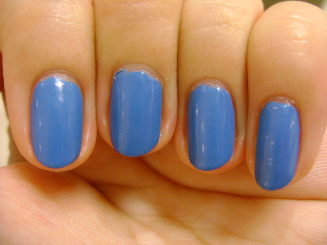
COLOR: Model Citizen is a blue-toned medium pink. I would call it a Barbie pink. I can't recall if it's the same shade as her lipstick but one of my Barbies definitely had heels in this exact color. It makes me think of summer vacation but the blue tone mutes it so it's not quite a tropical color. This shade of pink is bubbly and perky and hard to ignore but it doesn't aggressively shout its presence. It's very Elle Woods.
FORMULA: Again, I want to acknowledge that this is an older bottle of polish. But I found the formula very smooth and liquidy. I want to say it's maybe a little thicker than the Essie formula of the older bottles but it's still much more liquidy than most other polish brands.
APPLICATION: Applying the polish with my dominant hand, I found the first coat applied very smoothly. The brush did create some streaks but they mostly self-leveled. The polish was also already very shiny without top coat. The second coat also applied smoothly but I noticed the brush catching. When I worked the polish with the brush too many times, it would catch and look uneven from the brushstrokes. Two coats was fairly opaque for my short manicure but I applied a third coat to cover up the streaks that weren't covered evenly. I applied the third coat a little more thickly and it smoothed out a lot of the issues.
With my nondominant hand, the first coat went on smoothly but more streaky and uneven than painting with my dominant hand. Because the polish isn't too thick, the ridges weren't pronounced but there were thinner patches where the bristles of the brush had lifted the polish instead of painting it on evenly. I applied three coats, not bothering to make sure the polish was flush with my skin. Doing this, I ended up with a smooth, even surface over most of the nail but you can see the uneven overlap of polish towards the sides.
Because my Essie top coat was dried up, I just used Poshe. It did seem to lighten the polish a little. I'm not sure if it was the Poshe or if this polish takes a long time to set but I already wait at least 5-10 minutes between each layer and ten minutes after that I got some damage on a few nails when I tried to do things (open doors, pick up objects, etc.).

CONCLUSION: If you like the color, I'd recommend this polish. Application is relatively easy. I'm being a perfectionist but if you concentrated, I think you could achieve a very nice manicure. And you could certainly do a good job if you were working on someone else's nails. I like the high shine finish. I would just be a little careful about making sure it's totally dry. Maybe do your nails while watching a long movie.
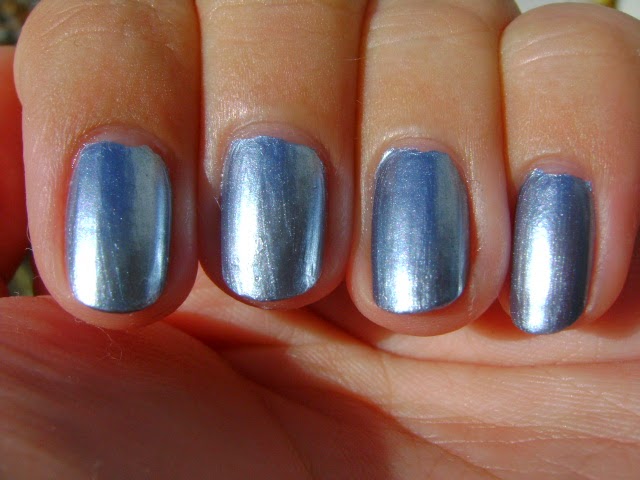
SWATCHES:

Thursday, August 11, 2016

REVIEW of Essie Strut Your Stuff With SWATCHES

Hello peaches,

I think it's time for a fun summer color. Though technically I swatched this polish at the end of March. Let's keep that our little secret. This is going to be a shorter review because I was busy and apparently I didn't take very many notes or photos.

Color: Essie Strut Your Stuff is a bright aqua blue creme polish. It reminds me of OPI's Can't Find My Czechbook but it's been a while since I swatched that one. As always if you'd like me to try to find dupes and do a comparison post, just leave a request in the comments. Bright blues like this aren't for everyone but when they're flattering to my skintone, they just make me happy every time I look down at my nails.
Formula: The formula for this polish was pretty thin, though I will admit I bought it secondhand so it's possible that it was diluted or that it's not the genuine article.
Application: The first coat applied smoothly without any drag. However, because the polish is so thin, it kept getting pushed around when I would try to paint another brushstroke. The brush was also more streaky than usual. The second coat also applied smoothly. On short nails, the opacity wasn't bad. It failed a light test because light could still pass through my nails but because the polish application was even, I think you could get away with it. I added a third coat to see what would happen. The results were slightly more opaque but not terribly different. I think the debate between two or three coats with this polish is just a matter of preference. Though, on my right hand (painting with my nondominant hand), two coats were not enough and I definitely needed three.

CONCLUSION: Assuming I actually bought a bottle of Essie Strut Your Stuff, yes, I do think I would recommend this polish. It's on the thinner side, but as long as you're OK with that look, it applied fairly well and the color looks great. I don't think it's a polish you need to own if you have a lot similar colors but if you're just looking for one that applies pretty well or you want to do some kind of jelly sandwich, Strut Your Stuff might be what you're looking for.
Please click the amazon.com affiliate before starting your next shopping trip at amazon.com. It would help me out so much.

SWATCHES 

Sunday, December 27, 2015

REVIEW of Essie Beach Bum Blu With SWATCHES

Hello darlings,

OK, time for a real review. Let's see if I still remember how to do this. ;)

I know Essie Beach Bum Blu has been around for a while but it was never one of those colors that called out to me. Then I found myself in Ricky's on a day when Essie polishes were on sale for $4 or $4.50 and my self control went out the window. So Beach Bum Blu came home with me. I picked it up thinking it might be something like Confetti Rhapsody in Blue and while it's actually a much brighter shade I find it quite flattering and I'm happy to have it in my collection.

Color: Beach Bum Blu is a beautiful aquamarine shimmer that borders on metallic frost. It's a lovely mermaid-y shade that really complements the yellow undertones in my skin. I would compare it to Maybelline Blue Blowout. In fact, if you'd like, ask in the comments and I'll do an actual comparison post.
Formula: I didn't find the formula notably thick or thin. It's a little different from a typical Essie polish because of the finish.
Application: The first coat went on smoothly without any drag. I couldn't really work with it though because the polish was thin so any pressure would push the polish around and result in streaks. Use a very light touch when painting overlapping brushstrokes. The second coat went on very smoothly. I could even out the polish at this point though I had to be careful because brushstrokes were visible. At two coats the polish was not opaque. I added a third coat which also went on smoothly. However, at three coats, the polish was still not opaque when subjected to a light test.
Wear: I've been wearing this polish for about 5 days. Aside from it not being completely opaque, I really like it and it's worn well. Tip wear is really minor. My only wear issue is that my right hand (the one I painted with my nondominant hand) got messed up in the middle of the night (the impression of the mattress has textured my manicure on my right hand). My left hand is fine so maybe I just didn't give the polish enough time to dry. I just thought I would mention it.

CONCLUSION: I find the color very flattering. If you're also attracted to colors like this and you don't mind the lack of complete opacity, I would recommend this polish. It applies easily and wears well.

 
Please consider helping to support this site by clicking on one of my amazon affiliate links to start your next shopping trip at amazon.com. It won't cost you anything extra and I will greatly appreciate it.

SWATCHES

Saturday, December 6, 2014

REVIEW of Essie Sand Tropez With SWATCHES

Hello lovelies,

Are you wondering why I'm reviewing a polish from Essie's Spring 2011 collection at the beginning of December? Well, in spite of its name and its official release date, Essie's Sand Tropez strikes me as the perfect fall color. Now, I've actually tried this polish before though this is my first time reviewing it. I had it applied at the salon  and shared swatches with you back in 2012. Please check out that post for better swatches of this polish in its sandy, yellow-toned form. I think I bought this polish shortly afterwards in 2012 because of some other posts... look, let's not get sidetracked. On to the review!

Color: Essie Sand Tropez is a neutral sand-colored creme polish. It has yellow and brown undertones and a slight dryness to it. It's almost a bit gray, the way concealer can look over dark circles when it's too light for you. This is another good foundation nails shade for me though it doesn't topple OPI Samoan Sand as my favorite foundation nails nude polish. I know everyone's not going to love the way this looks against my skin tone but I'm into it. There's something about the way it's not a perfect match that I like. I encourage you to look at the swatches in that old post as well as the ones in this post. It's difficult to get the swatches I want all the time in winter when the sun is in hiding.
Formula: This polish has a thinner formula.
Application: The first coat of this polish went on smoothly with no drag though the results were a little streaky. This has one of those thin Essie brushes that I like but it's a bit annoying with a streaky polish. The second coat also went on smoothly but streaky. I had to even out the polish a bit and it still wasn't perfectly smooth. However, because the polish is thin, it doesn't create really thick ridges where the brushstrokes overlap. I was able to even out the polish more by applying the third coat carefully. At three coats the polish is still not opaque. It looks fine but it's totally unable to block light in a light test. Even if application hadn't been streaky it still wouldn't be opaque. Adding top coat also evens out the polish a bit. The final manicure is perfectly acceptable but it's not the perfect, even manicure I can get with other polishes. I do think it's pretty good for a nude creme though.
Wear: I wore this polish for six or seven days. Yes, that's a rather long time for me but it wasn't practical to switch polish before then. I got some tip wear pretty early on and I chipped one nail (not the polish, but the nail) but there were unusual circumstances. I was putting together a set of drawers. More on that in another post. I filed that nail down and carried on with no other damage.

CONCLUSION: I would recommend this polish. It's a pretty version of foundation nails for me and I'm glad I have it in my collection. Application isn't perfect but it's manageable. The biggest strike against this polish for me is that it's not fully opaque. But it wears pretty well, I like the color, and I can manage the application. So it's a middling polish instead of a favorite.

If you're planning on doing some shopping at amazon.com, please consider getting there through one of the links on my site. I will get a small percentage of what you spend at no extra cost to you. I would really appreciate it if you could help me out. 

SWATCHES

Sunday, October 19, 2014

REVIEW of Essie Blue Rhapsody With SWATCHES

Hello my morning glories,


Get it? Cause they're blue? Anyway, Essie Blue Rhapsody is yet another one of the polishes I picked up in my San Gennaro polish haul. I was hoping it would be somewhat of a dupe for Confetti Rhapsody in Blue which is one of my favorite polishes but now that I've tried it, I don't think that it is. I can still do a comparison if you'd like me to. Just leave a message in the comments.

Color: Essie Blue Rhapsody is a metallic blue chrome polish. For me, it's not smooth enough to be a proper chrome but that's what they're going for. It's too metallic to count as another finish. There's not a lot to say to describe the color of Blue Rhapsody. It's a metallic blue, somewhat muted. It's not pale enough to be close to the pastel end of the spectrum but it's not dark enough to be a medium blue. If you want a cool-toned blue that's not cold enough to be really icy, Blue Rhapsody is your color.
Formula: I think this is a little on the thicker side but not too much so.
Application: The first coat of polish went on smoothly. This was my issue. So you know you use three brushstrokes to cover the nail? Well, with that third brushstroke in the center, I could not get an even coat. Either the third brushstroke was hard to even out or the edges of the first two brushstrokes wouldn't smooth out. I was into the way it looked like I had painted liquid metal on my nails. The second coat also went on smoothly without any drag and it was easier to even the polish out. Still, the results were not fabulous. The polish isn't thick enough to make the overlapping brushstrokes a problem but it could look nicer and there was a bit of bubbling/grit on some of the nails. It was more on the nails of my right hand which is why you don't see it as much in the photos. With a chrome I don't want bubbles or to see the seams/overlapping brushstrokes so this was a letdown. On short nails, I think two coats of polish was sufficient for opacity.
Wear: I wore this polish for 5 days. I experienced considerable tip wear with a little bit of chipping at the tips of two nails. Now, as previously mentioned on this blog, my version of chipping is not that big of a deal. But considering that I barely even get tip wear with most polishes, I think it's notable. I'm not sure if this was because I only used two coats of polish or because this polish just chips more easily than most of the other polishes I've tried. Even though I removed the polish after 5 days, the chipping occurred a day or two before that.

CONCLUSION: I can't enthusiastically recommend this polish but if you love the color and can deal with the issues it might be worth looking into. It's opaque in two coat on short nails but application is a little iffy and it doesn't seem to wear well. However, it's an interesting enough color that you might not find a dupe that easily. Personally, I think I'd rather have another bottle of Confetti Rhapsody in Blue but I'm sure I'll find uses for this.
Please consider making your next purchase at amazon.com through one of my links. Regardless of what you purchase, as long as you start your shopping trip by clicking one of the links of my page, I will get a small percentage of the revenue at no extra cost to you. I appreciate your support.
SWATCHES

Tuesday, January 28, 2014

REVIEW of Essie Mesmerize With SWATCHES

Hi bumblebees,


I'm back with another impossible to photograph blue nail polish which means I get another chance to mess about with my photo editing software. Hooray. By the way, I had to download Picasa onto my laptop again and it was scary as hell. Google, please stop making me feel like you're trying to steal my soul. Or at least all the content I generate. It's ridiculous that when you first start Picasa it starts downloading all your photos and there's no way to stop it. Some things are private and I'll add them to Picasa if or when I feel like it.

Color: Mesmerize is a medium blue creme polish. I would call it a primary blue or a true blue. It's a saturated, intense blue but it isn't a bright color.
Formula: I didn't find it notably thin or thick.
Application: The first coat applied smoothly. I found the polish very easy to work with. The second coat also applied smoothly without any drag. I noticed a little bit of threading (where the polish forms small threads as you pull the brush out of the bottle) but it didn't affect application. I did have to even the polish out a little with the brush but it wasn't a problem. At two coats, this polish appeared opaque but since I was wearing it with shorter nails, you might need a third coat to get to full opacity with longer nails. A more intense light test with a flashlight revealed that the polish was not completely opaque as there were a slight space in between brushstrokes.

CONCLUSION: If you're looking for a nice blue creme polish that's easy to work with and fairly opaque, I would recommend Essie Mesmerize. It isn't the most exciting color and you could easily find a dupe but application is great and unless you can find a cheaper dupe, there's no reason to not pick up Mesmerize if you're looking for a blue creme polish for your collection.

SWATCHES

Friday, September 13, 2013

REVIEW of Essie Butler Please With SWATCHES

Hello chickadees,
Today I'll be reviewing another blue polish for you. I know. I know. You've probably already seen reviews of Essie Butler Please or one of the bajillion comparison posts comparing it to all the other blue polishes including Nails Inc. Baker Street. I'm thinking of doing this peacock nail art look and PolishAholic reports that Baker Street is brighter than Butler Please and from the swatches I've seen, I think it could be the perfect blue of a peacock's body. But I'm not sure that's enough to justify buying a very similar bottle of blue polish. Why am I telling you this? I don't know. On with the review!

Color: Essie Butler Please is a medium blue creme polish. I think it's just a touch off from what I would consider primary blue. It's a little dustier. I want to say it has purple in it but that's a lie. It just has this look of a primary blue that is slightly faded.
Formula: Eh. See the application section.
Application: Where to begin? OK, let's take this one hand at a time. Painting with my dominant hand, I did a thin first coat on the nails of my left hand. The first coat was smooth but not even. The coat was too thin to really get coverage and the polish applied patchy. The second coat still applied smoothly. I noticed that the polish looked a bit odd at this point. It wasn't drying matte but it wasn't shiny either. I then applied a third coat as the polish wasn't fully opaque. The polish got a little gloopy at this point. I could tell that my nails were not perfect without top coat. It might have been the weird finish but the top coat made the polish look noticeably darker. Painting with my nondominant hand, something happened to the polish. The temperature of the room hadn't changed and I really have no explanation for why this polish lost its mind. The polish got very thick and started threading. What I mean is that as I pulled the brush from the bottle long "threads" of polish clung to the brush. It was very hard to get even coats of polish. The brush started dragging and the polish was a thick, gloopy mess.
Wear: I wore this polish for five days. I was unable to wrap the tips of my nails on my right hand (for obvious reasons) and experienced a tiny bit of tip wear. Also, the polish looked a bit dull. I never refresh my polish with top coat but this might be a polish where you would need to do so to keep it looking shiny.

CONCLUSION: I don't know. This would have just been an OK but not great polish if I had only done my left hand. But for whatever reason it became a mess when I tried to paint the nails on my right hand. It's a nice color but it is dupeable and personally I still have my eye on a brighter color like Nails Inc. Baker Street might be. So I can't recommend this polish based on my experience.

SWATCHES

Sunday, August 18, 2013

REVIEW of Essie Smooth Sailing With SWATCHES

Hello my little catamarans,

I picked up Essie Smooth Sailing when one of my favorite local nail/beauty supply stores, Eve Beauty Source, was having their closing sale. I forget what the discount was, but it was good enough for me to pick up a few bottles of polish that I probably wouldn't have purchased without the discount. One of those polishes was Essie Smooth Sailing, which I had originally read about on Musings from Manhattan when I still followed that blog. Nothing against her, but she doesn't update frequently enough. I know that's rich coming from me, but... you know what? Hush. ;)

Color: Essie Smooth Sailing is a medium blue polish with silver/gray shimmer. I would call it a flakie but it the flakes are small and subtle. It reminds me of Zoya Skylar though they aren't quite the same. A comparison is probably in order. I think the color is one of those muted blues that is good for someone who is a little afraid of color or who is looking for a more mature blue. The finish aside, this color strikes me as more mature than all the super bright or neon blues that I usually see in the summer collections. The color and the finish really remind me of blue jeans for some reason. The flakes/glitter give the polish a nice depth and while they're visible, they aren't in your face like a traditional glitter or flakie polish. It's more like a subtle shimmer.
Formula: The formula is a little watery. This is definitely one of those polishes where you have to be careful about how much polish you have on the brush.
Application: The first coat applied smoothly without any dragging but it also applied kind of sheer and uneven because the polish wasn't thick enough to really cover the nail. With the second coat I noticed that I could see where the brushstrokes overlapped and the polish was still far from opaque, particularly because of the patchiness and balding. With the third coat I definitely noticed the brush dragging a little more. However, the polish was opaque in three coats (except for one spot on my index finger that I had to go back over with a fourth coat). When I was painting with my nondominant hand, the situation was basically the same. Application wasn't any better but it wasn't any worse.

CONCLUSION: Even though I was fairly critical about the application, I would recommend this polish if you really love the color. It's an OK polish. It's not perfect so it's probably not going to be the best polish for a beginner but it's manageable and if you have a steady hand you should be able to get even coverage and in the end, the polish looks fine. Personally, I think the blue is a touch too dark for me and it kind of ages my hands.
Cat is a participant in the Amazon Services LLC Associates Program, an affiliate advertising program designed to provide a means for sites to earn advertising fees by advertising and linking to amazon.com. If you would like to help support this site, please consider making your next purchase at amazon.com through the links on my page.

SWATCHES

Thursday, August 8, 2013

REVIEW of Essie Fruit Sangria With (Terrible) SWATCHES

Hello chickadees,
Do you know how hard it is to think of innocent nicknames that urban dictionary doesn't have a disgusting definition for? In other frustrating news... Gah! This polish was impossible to photograph properly. Impossible. I tried every lighting condition I could think of: indoors, outdoors, morning, noon, night, with flash, without flash, all my camera settings, different cameras... until I finally gave up. But, I can still review this polish so I am going to get to that without further delay.

Color: Essie Fruit Sangria is a saturated pink creme polish. I would call it a hot pink but it can look a little more red under dim lighting conditions or indoors and it can also become a little deeper and more magenta. It doesn't always have the same brightness and intensity. It contains a very subtle gold shimmer (which could arguably be called a frost finish) but it's so subtle that you're really not going to notice it except in rare instances. I can only see it when I'm in my kitchen. It reminds me a lot of Essie Sweet Talker if you're familiar with the finish of that polish. My review is here but it was one of my earlier posts and doesn't have the best swatches.
Formula: The formula is pretty standard, not noticeably thin or thick in consistency.
Application: The first coat applied very smoothly. With the second coat, I tried to get the brush right at the edge of the nail so it wasn't as clean as I would have wanted it to be. So, I added a final third coat. I could have gotten away with two coats. At two coats the polish was not fully opaque when held up for a light test but the coverage was pretty even. The third coat applied very smoothly with no dragging. The results were pretty much the same when painting with my nondominant hand though I noticed more dragging and uneven application on the second coat. With the third coat I managed to even out the polish except on a few fingers where you could see the overlapping brushstrokes. I should also point out that it might be the new bottle of Seche Vite that I'm using but my nails weren't as shiny as they normally are and don't have that same slick feeling. Now it's usually glitter polishes that eat up top coat but I did notice the lack of shine.

CONCLUSION: I am not adamantly against you buying this polish but it's hard to recommend this polish over another when the color is so easy to dupe and the shimmer isn't really apparent. It's a pretty pink that's bright but also somewhat demure. I prefer when it's more of a hot pink because it makes my skin appear paler and brighter whereas when it is more of a muted magenta/red it makes my skin look darker but also duller. I guess if it's on sale and you like the color, you should know there are a few application issues but on the whole it's a fine pink polish, but it if you have the choice, I would look for something else.

SWATCHES (None of them are color accurate)

Thursday, July 18, 2013

REVIEW of Essie Where's My Chaffeur With SWATCHES

Hello my lovely social butterflies,
Today I have a polish that certainly sounds like it belongs in your collection: Where's My Chaffeur from Essie's Winter 2012 collection. However, I don't think this polish will meet the standards of any high maintenance types. Why? Well, I am a glad you asked, imaginary voice of the audience.

Color: Essie's Where's My Chaffeur is a turquoise green creme polish. It's in the blue green family of colors but it definitely leans more towards the green side of the spectrum. That was a little disappointing for me as this polish appears quite blue in a lot of swatches online.
Formula: The formula is smooth and has a liquid-like, thinner consistency.
Application: The first coat was smooth. On the second coat the brush was a little streaky and dragged through the polish. On the third coat, I still found that the brush was dragging through the polish so I would recommend using thicker coats just to avoid this. At three coats, this polish still failed the light test because of the uneven application but I was not about to add a fourth coat. I added 2 coats of Seche Vite in an attempt to smooth out the polish. My Seche Vite is already starting to thicken up so any bubbles in the swatches are from the Seche Vite.

CONCLUSION: I am very disappointed with the formula of Essie's Where's My Chaffeur. There are some polishes that make it look like you can't do your nails. This is one of those polishes. I would have also preferred a color that was a little more blue than green. It should be easy to find a dupe or a very similar polish so no, I would not recommend Essie Where's My Chaffeur.
Cat is a participant in the Amazon Services LLC Associates Program, an affiliate advertising program designed to provide a means for sites to earn advertising fees by advertising and linking to amazon.com. If you would like to help support this site, please consider making your next purchase at amazon.com through the links on my page.
SWATCHES

Wednesday, July 3, 2013

REVIEW Essie Maximillian Strasse-Her With SWATCHES

Hello peanuts,

It has taken me forever to review this polish because I took so many swatches that I then had to comb through for color accuracy. Why? Because Essie's Maximillian Strasse-Her is a very odd polish. A large part of why I bought this polish was due to its popularity when I pinned it to my Pinterest board of Nail Polish Swatches. I think perhaps that's part of the reason why I'm not crazy about it. It wasn't one of those polishes I obsessed about for a long time before I purchased it.

Color: Where do I even begin? Essie Maximillian Strasse-Her is a light green creme polish. No. It's a gray creme polish. No. It's sort of both. And, no I don't mean that it's a duochrome. I don't really find the color appealing. I prefer Essie Sew Psyched or Essie Da Bush or just a gray creme polish. The particular mix of greenish gray that is Essie Maximillian Strasse-Her just doesn't seem very pretty or odd enough to visually interesting.
Formula: The formula was a little thick.
Application: The first coat was very smooth but I found the polish to be a little thick and streaky on the second coat. The brush also dragged a little but that was only an issue on my thumb. If you use thicker coats, you should be able to get away with two coats of polish. If you use thinner coats, you will need three coats to reach full opacity. I used a slightly thinner first coat on my pinky so I ended up needing three coats on that nail. I'm not sure if it made a difference in application but it was very hot on the day I was painting my nails. When I did my right hand (painting my nondominant clumsy hand) I also used two coats but I found the streakiness much more apparent and I could definitely see the bald patches when I held my nails up to the light. It was a little cooler that day and the polish still seemed rather thick.

CONCLUSION: Personally, I don't feel like this is a polish I need in my collection and I had some trouble with the formula. However, if you like the color, the formula is manageable if not enjoyable to work with.

SWATCHES

Tuesday, July 2, 2013

REVIEW of Essie Avenue Maintain With SWATCHES

Hello chickadees!


Today I decided to review the other polish I wore during my trip, Essie Avenue Maintain. Silly me, I brought all my manicure supplies except my Seche Vite so I spent the first few days of the trip looking for a store until I finally settled on a bottle of Art Deco 913 Speed Dry Top Coat. Thank goodness it worked better than all the non Seche Vite brands I've tried in the US (Sally Hansen, Revlon, Rimmel, etc.). I may eventually review this top coat (which I've used three times so far on a manicure and pedicure for myself and a pedicure for my mom) but I just wanted to let you know I used it for this manicure in case there's a noticeable difference in the way the polish looks (but there shouldn't be).

Color: Essie Avenue Maintain is a medium blue creme polish. I like to think of it as a cornflower blue but it might be a shade or two darker depending on your definition of cornflower blue. Like any blue polish, it provides a pop of color but it's not as bright as a neon or a royal blue while not being as safe as a pastel. I think it's a good color for someone who wants to take a risk with color without calling too much attention to their nails. It adapts to the outfit you pair it with. It's a very difficult blue to photograph so I suggest you look at a lot of swatches online. It tends to photograph lighter than it really is.
Formula: The formula is smooth but on the thicker side for an Essie polish.
Application: I used two coats because I was on vacation and in hotel rooms and feeling lazy. In two coats there was a little patchiness but nothing that bothered me and I'm sure three coats would have been perfect. Application was pretty smooth. It wasn't as good as some of my perfect Essie formulas but I had no major complaints.

CONCLUSION: Yes, if you like the color, I would recommend this polish.
SWATCHES

Wednesday, June 26, 2013

REVIEW of Essie Mint Candy Apple With SWATCHES

Hello chickadees!


I enjoyed my vacation (more or less) but it's very good to be back home. One might even say, it's refreshing. And so I've decided to review Essie's Mint Candy Apple, the polish I wore at the beginning of my trip. But though it's a refreshing minty shade of blue-green, it was rather disappointing in other ways. Let's break it down, shall we?

Color: Essie Mint Candy Apple is a bright minty blue creme polish. It's a bit too bright to be a straight pastel but it's not bright enough to be a true bright or a neon. I wish I'd been home to take these swatches so the polish would appear a little brighter but this is what you get when you go to Germany at the tail end of a storm.
Formula: Terrible. I've chosen this color on one of the few occasions that I've gone to a nail salon and I noticed how thick the formula was but I thought it might have just been the bottle they had at the salon. It wasn't.
Application: The first coat was a little streaky but that's not out of the ordinary for a color like this or really most creme polishes. The second coat was still a little streaky and there was a bit of bubbling. In three coats, the polish was opaque. After I've applied a layer of top coat (Seche Vite) the polish still looked pretty bad. I've certainly dealt with worse polishes but there was no disguising the bad formula and application with top coat. Overlapping uneven brushstrokes were very apparent. And the thickness of the polish was definitely noticeable.
Wear: Obviously, I was irritated with the way this polish looked. But even worse, 2-3 days into wearing this polish it started chipping. For those of you who are new to this blog, my polish almost never chips. I could count the number of times my polish has chipped on one hand. And I'd never expect it of such a popular Essie polish.

CONCLUSION: No, I would not recommend this polish. I do like the color but there are plenty of dupes and similar shades and the terrible formula and application and easy chipping makes it impossible for me to recommend this polish.
 
SWATCHES

Tuesday, March 12, 2013

Update and Bad Swatches

Hi chickadees!

Have you missed me? I've been here. Life has just been a little crazy with a lot of things piling up lately. Added to the miserable weather and my perpetually average state of health and I haven't really felt like writing posts lately. Also, my lips are back to being dry and awful looking so it really isn't the best time for testing lip products. But I do have some nail polish reviews and I am slowly getting through the makeup I need to test, though with 8 AM classes, it's hard to find the time to apply makeup before running out the door.

I've been keeping these awful, not color accurate in the least swatches from when I let someone do a hack job on my nails at a salon. They're of Essie's Headmistress and I thought I'd just share them now as I don't really like this color enough to purchase it and swatch it for myself. This is three coats. Like most reds it was very difficult to photograph. Outdoors in direct sunlight it photographed much brighter than it actually is. It's somewhat similar to Sally Hansen Red Zin, kind of a muted, medium dark red like a brick red.

These photos are still a bit too bright but this is the best I could do. I know the manicure looks messy. This is what I get for letting someone else do my nails.


These are the swatches that are entirely too bright.

Saturday, February 23, 2013

REVIEW of Essie Jelly Apple With SWATCHES

Hello my darlings,
I have finally found a red creme polish that I love. Unfortunately, it's a pain in the arse to photograph for swatches. After multiple attempts I began to approach color accuracy but I definitely didn't manage to get all the way there. Although it's a true red polish, in my photos it kept pulling orange. I actually threw out swatches where this polish basically looked orange. It was very frustrating. I'm only telling you this as a preamble because I don't want the swatch at the top of the review to dissuade you from continuing to read if you don't like orange polish. Trust me, this is not an orange polish in the slightest.

Color: Essie Jelly Apple is a true red creme polish. It provides a nice pop of color to the nails, especially in winter and it's just a touch brighter than what I would call a "classic" red. I would call it a bright tomato red, though in dim lighting it approaches that classic red shade.
Formula: The formula was one of those perfect Essie formulas. Thin enough to be the perfect consistency for easy application.
Application: Application was very smooth. I thought the polish looked relatively opaque in two coats, but I hadn't painted it flush to the skin on the sides of the nails so I went in with a third coat to fix that up.

CONCLUSION: I would absolutely recommend this polish. I may even pick up another bottle so I'll have a back-up of my new favorite red.
SWATCHES

Thursday, February 7, 2013

REVIEW of Essie Da Bush With SWATCHES

Hello chickadees!

Now every nail polish addict has a polish in her life that she desperately wants but resists buying. Sometimes more than one, which could be a good thing or a bad thing depending how you look at it. For the longest time, Essie's Da Bush was that polish for me. I'd seen swatches of it online and I thought it would be incredibly flattering for my skin tone but I couldn't find it anywhere and didn't feel a strong enough craving to buy it online. Sometimes you get into that frame of mind where you feel like if something's meant to happen, the stars will align and it'll happen on it's own. And then one day I was in Eve Beauty Source in Soho and there it was, minding its own business. And I stared. And bit my lip. And waffled and wandered and wavered until I finally took the darn bottle up to the cash register and paid for it. And like any good result of contradictory impulses I'm still unsure of whether I made the right decision.

Color: Da Bush is a lovely, dusty pale green creme polish. I would call it a grayish green but that gives the impression that it's a dull, depressing color. It isn't. In truth, it's just as beautiful as I thought it would be from the swatches I've seen online. It is such a flattering shade, perfect for my skin tone, subtle enough to be a nude and with enough green to make it interesting on the nails. Indoors, I sometimes think it has somewhat of a brown/beige tint mixed in with the grayish green. It can also look like a basic gray indoors if you're not really focused on identifying the color. It's the same way a dark polish color can end up looking like black indoors. While I think it's beautiful on its own, it would also make a lovely base color for nail art.
Formula: The formula is on the thinner side and somewhat more sheer than I would like.
Application: Here's where we run into a problem. The first coat was streaky on the nails where I wasn't careful so this isn't an easy application. You have to be very aware of what you're doing and adapt your technique based on how the polish is behaving. On the second coat, I noticed that the brush seemed to be creating streaks/ridges in the polish. On the third coat, I used a thicker coat of polish and angled the brush so it was almost flush with nail and the brush could barely run through the polish. On the third coat the polish was opaque but could still see a few small spots during the light test because of the streakyness during application. I will say that Seche Vite evened out a lot of the small ridges. About 1.5 feet from my face, I can't see an issue with my nails, for instance when I'm typing, but if I'm any closer I can see where the coats of polish overlap unevenly.

CONCLUSION: If you're like me and you are dying to have this color you might be able to deal with the issues with the formula and application. It's certainly not the worst polish I've ever tried but it's a little tricky and it takes some work.

SWATCHES

Monday, December 3, 2012

REVIEW of Essie Chinchilly With SWATCHES

Hi chickadees!

Chinchilly has been around since Fall 2009 so I'm sure you've already seen swatches and read reviews. Here's my take on the matter.

Color: Essie's Chinchilly is a basic creme polish. I suppose you'd say that it's light gray but I think depending on the lighting, it can also look like a light brown or a light purple color. It's not a duochrome, but it looks slightly different depending on whether you're outdoors in direct sunlight or in the shade, or indoors in fluorescent lighting or in dim lighting. I think Chinchilly comes very close to clashing with my skintone. It's not terrible but I wouldn't say it's a color that really suits me either. Whatever the color is, it doesn't remind me very much of a chinchilla.
Formula: I thought the formula was very smooth, though a bit thin and watery. I'm not sure if you'll be able to see a difference but for the two nails on the left I used 3 coats and for the two nails on the right I used 4 coats to get the polish opaque.
Application: Application was pretty smooth when I was using my dominant hand to paint. The watery formula wasn't a major issue and any cleanup was easy. I had a bit of difficulty getting even coats painting with my non-dominant hand but I thought it looked alright in the end. It's just that I can't declare it a perfect Essie formula because of the thin formula and the lack of ease when painting with my non-dominant hand.
Wear: I removed the polish after 6 days and there was definitely tip wear. It may have started before day 6 but I wasn't paying very close attention.

CONCLUSION: I don't think this color will be everyone's cup of tea but it definitely has a cool, chic vibe for something named after a rodent (adorable as they might be). If you like the color, I think the formula is acceptable though not spectacular. I'd probably recommend this polish but I don't think I'll be repurchasing it as the color isn't quite right for me.
SWATCHES

Wednesday, November 28, 2012

REVIEW of Essie Bahama Mama With SWATCHES

Hello chickadees!

Essie's Bahama Mama is not a new color but is it just me, or does it seem like every beauty blogger has been raving about it for the past few months? I... like it. I'm just not all that thrilled. I want to do a comparison post soon because it feels so reminiscent of other colors I already own. And I probably need to reswatch anyway since I don't have any photos in natural light. Let's get into what may be my shortest review to date.

Color: Bahama Mama is a red-based purple polish. For me, it was very red. Almost like oxblood for the majority of the time.
Formula: It was more or less opaque in 3 coats. I think it was a little thin because I did notice a bit of balding.
Application: Application was very smooth. No issues.
Wear: This polish started to look dull very quickly. It was also one of those polishes that picked up smudges very easily instead of keeping that nice, shiny finish.

 
 SWATCHES

Sunday, October 14, 2012

REVIEW of Essie's Lacy Not Racy With SWATCHES

Hi darlings!

So, today's dash of insanity is not really part of the post itself. You can't tell from my swatches (since they are close ups of my hand) but I kept getting home late the week I had painted my nails with Essie's Lacy Not Racy so on day 2 of wearing this polish, I just grabbed my camera and took it to school with me. So I took the majority of these pictures (and many more because I take way more pictures than I actually show you in my attempt to get high quality, color accurate shots) in public. I'm usually out on my balcony when I do my swatches. Let me tell you, when you are taking pictures of your hand out in public, people look at you like you're crazy. And I live in NYC. Anyway...onto the review!

I bought this after reading a post on egnailsit.com. I love the sisters behind eleventhgorgeous by the way. You should absolutely check out their youtube channel. I think they're hilarious. Anyway, I bought this polish because every single fashion magazine has been going on and on about oxblood and I'm not the kind of person who invests in a purse or a pair of shoes in the color of the season. Nail polish is so much easier. So, I ran out to Eve Beauty Source, my local source for old Essie polishes. They're $6.99 so I save the tiniest bit of money. I grabbed all of these oxblood/dark red polishes and then decided to get Lacy Not Racy anyway. Another dash of insanity.

Color: I am not comfortable calling this oxblood. I think it can occasionally look like oxblood, but to me, it is darker than oxblood. I would categorize it as wine red. The deepest, richest, darkest kind of wine red. And, indoors in dim lighting it can go very dark until it's almost black. But I did the guy test (where you ask a guy what color he thinks your nail polish is) and he said it was dark red so don't worry, it's not one of those dark polishes that just ends up looking black.
Formula: It wasn't a perfect Essie formula. It may have been a bit watery but it certainly wasn't unmanageable at didn't run into my cuticles or anything like that. My main problem was that I needed FIVE coats to get it fully opaque. FIVE coats. For a dark polish. What!?!
Application: Application was not bad. The polish glided over the nail very smoothly. It was just very difficult to get even, opaque coats. I won't say it was patchy but it did seem oddly sheer. FIVE coats!
Wear: This is one of those polishes that picks up smudges easily and it does start to look a bit dull. I'm not one of those people who applies fresh top coat every day though so it might make a difference if you do.

CONCLUSION: While I don't think it wears spectacularly and it isn't oxblood, I think Essie's Lacy Not Racy is a beautifully vampy, sexy wine red and I do like it. Wear could be better and I hate the idea of applying 5 coats but it applied very smoothly and if I can't find a better dark red, I would repurchase it.

 
SWATCHES

REVIEW of Essie's Mochacino With SWATCHES

Hi chickadees!

I painted this on my nails a few weeks back, (I think it may have been the beginning of September) but it always takes me a while to do my review posts. Well, no, I shouldn't say that. Sometimes I write them the next day. What am I going on about? Anyway...there's your dash of insanity for the day. Onto the review!

Color: This is difficult because when I first painted Mochacino on my nails it was an unexpected love and then after a few days I got bored with it and tried a splatter manicure. I'm flighty that way sometimes so it's not really a reflection on the polish. I also am not that fond of brown/beige polish. Mochacino is a dusty light brown polish with a ton of golden shimmer. When I was in love with it, I thought it was the prettiest kind of latte color (I'm assuming, as I don't drink coffee) and I adored the way the shimmer gave it so much depth. After being disappointed in some Essie shimmer polishes in the past, this one definitely did shimmer the right way. But then as I continued to wear it, I wasn't a fan of how it sometimes made my hands look a bit red. And it was either getting dull or I was starting to see the color as dull. I couldn't tell. Also, there was a decent amount of tip wear. No chipping (I never get chipping) but a noticeable wearing away at the very tip of the nail.
Formula: I used 4 coats to get it opaque. You could definitely get away with 3 but I'm the kind of person but cannot stand holding my nails up to the light and being able to see through them. And to do a fair comparison, I think all polishes should be judged on the same (possibly demented) criteria. There was nothing about the smoothness or thickness of the polish to really comment about.
Application: Application was reasonably smooth. Mochacino does not have one of those perfect Essie formulas but application was pretty good. No major complaints.

CONCLUSION: In the first day or two I had applied it, I would have told you I was ready to run out and buy another bottle. I still won't rule out repurchasing when I run out but I'm not all that crazy about it. I'm glad I found a color like this that I like but I'm annoyed at 4 coats (which should really only be for sheer polishes or light colors) and it does seem to get dull (at least in my eyes) after a few days of wearing it.
SWATCHES