Hi sugarplums,


I did not like this polish. I did not like this polish at all. OK, to be fair that's a bit of an exaggeration. I didn't love the color of this polish but I was fine with it. But in every other respect, I did not like this polish at all. Sigh... Let's just break it down before I start to get irritated again.
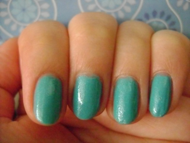
Color: Sweet Dreams is a saturated aqua blue polish. I hesitate to call it a shimmer as it doesn't have the smooth, refined look of most shimmer polishes. This is the tacky, low-end version of shimmer which is just tiny flakes of glitter. It reminds me a lot of the sort of greasy look of Zoya Skylar. You'll see what I mean in the swatches. For whatever reason this polish makes me think of a bad under-the-sea themed prom or a ocean diorama project. There's just something about it that feels cheap and juvenile. The color is strong but it's not really vibrant and more intense on nails than it appears in the bottle. The polish leans pretty green so don't expect a basic blue. I have no idea what they were thinking when they named this polish. It doesn't feel like the nude or pastel polish you might associate with sweet dreams and I'm certain Annie Lennox wouldn't approve either.
Formula: The formula is thick.
Application: This is one of those odd polishes where application is smooth and the brush doesn't drag through the polish but it's very difficult to get thin, even coats. The easiest way to work with it is to paint on thicker coats. I needed 2 coats to get this polish to full opacity.
Wear: I wore this polish for less than 24 hours. I really didn't like it. But as I removed it, it stained by nails a little so that I had to keep going back with nail polish remover to full remove all the blue. And this was using Zoya Remove+ which is stronger than my regular nail polish remover. The polish didn't stain my skin.
CONCLUSION: I would not recommend this polish. The color isn't all that remarkable and the finish makes it unflattering and cheap-looking. The application isn't great either. It's a polish you can work with, but for me it's not one that I want to work with.
SWATCHES


I did not like this polish. I did not like this polish at all. OK, to be fair that's a bit of an exaggeration. I didn't love the color of this polish but I was fine with it. But in every other respect, I did not like this polish at all. Sigh... Let's just break it down before I start to get irritated again.
Color: Sweet Dreams is a saturated aqua blue polish. I hesitate to call it a shimmer as it doesn't have the smooth, refined look of most shimmer polishes. This is the tacky, low-end version of shimmer which is just tiny flakes of glitter. It reminds me a lot of the sort of greasy look of Zoya Skylar. You'll see what I mean in the swatches. For whatever reason this polish makes me think of a bad under-the-sea themed prom or a ocean diorama project. There's just something about it that feels cheap and juvenile. The color is strong but it's not really vibrant and more intense on nails than it appears in the bottle. The polish leans pretty green so don't expect a basic blue. I have no idea what they were thinking when they named this polish. It doesn't feel like the nude or pastel polish you might associate with sweet dreams and I'm certain Annie Lennox wouldn't approve either.
Formula: The formula is thick.
Application: This is one of those odd polishes where application is smooth and the brush doesn't drag through the polish but it's very difficult to get thin, even coats. The easiest way to work with it is to paint on thicker coats. I needed 2 coats to get this polish to full opacity.
Wear: I wore this polish for less than 24 hours. I really didn't like it. But as I removed it, it stained by nails a little so that I had to keep going back with nail polish remover to full remove all the blue. And this was using Zoya Remove+ which is stronger than my regular nail polish remover. The polish didn't stain my skin.
CONCLUSION: I would not recommend this polish. The color isn't all that remarkable and the finish makes it unflattering and cheap-looking. The application isn't great either. It's a polish you can work with, but for me it's not one that I want to work with.
SWATCHES

The indoor shots like this one are a lot more color accurate. As always, I've arranged the pictures from most to least color accurate.


No comments:
Post a Comment