Sunday, August 25, 2013

Sally Hansen Insta-Dri Fast Dry Nail Color in 460 Snappy Sorbet

Hello my little sorbettos,

Oh my God, I can't even remember when I bought this polish. I feel like it must have been ages ago. I think I wanted to try this back in October as a pumpkin orange fall shade. There are just some polishes that never seem appropriate for the season or the occasion. But finally in the middle of August, I felt like painting my nails bright orange. So here were are. I have swatched this polish once before in my orange/coral polish comparison which you can check out at this link.

Color: Sally Hansen Snappy Sorbet is a orange creme polish. It's a fairly standard orange. It doesn't lean red-orange like a lot of the oranges that have been released in recent collections in the past year or two and it's not as bright as some of the neons. Instead, it feels like a safer alternative that appears muted beside those colors, though still fairly loud in its own right. I suggest checking out that comparison post I linked above as it photographed a little more accurately beside the peaches and corals in my collection. While it isn't a horrible color, I don't think it flatters my skintone and it makes my skin look dull.
Formula: The formula is on the thicker side.
Application: The brush for this polish is horrible. It's a wide brush which is already a point against it for me and the way the bristles are cut is just ridiculous. It's like they weren't even trying. I was afraid that the brush was going to create a lot of problems so I painted thicker coats than I normally do. The first coat was a little streaky but not too bad, though I immediately got bubbles on two nails. I also immediately noticed how badly this polish smells and how strong the smell is. The second coat was even more streaky. I had a very difficult time trying to getting the polish to even out, though the polish was pretty opaque aside from the balding and patchiness. With the third coat of polish I noticed the brush dragging. In short, my nails looked like an absolute mess. My Seche Vite worked wonders but you can still tell at the sides of the nail that this polish didn't apply evenly.
Wear: I could only put up with wearing this polish for two days. After two days of wear, it was already very tough to remove and stained a little. I can only assume that if you wear this polish longer it could stain worse and be harder to remove.

CONCLUSION: No, I would not recommend this polish. It was a pain in the arse. There are plenty of orange polishes out there. You do not need to struggle with this one.

SWATCHES

Wednesday, August 21, 2013

Update

Hi chickadees,

I feel like we haven't chatted in a while so I wanted to take a little break from the regular posts and reintroduce myself to you. Hi, I'm Cat. I'm not sure if all of the people who find their way to my page know much about me. Truthfully, I don't know that much about myself at this point. There aren't a lot of convenient labels I can attach to myself so let's not get into all of that right now.

Instead, let's focus on this blog. When I started I was basically just keeping a collection of my random thoughts. And as I got more into the beauty world on blogs and on youtube I started to do more nail polish reviews and more makeup and skincare product reviews. I would say I'm pretty excellent at doing my own nails but I'm certainly not an expert on makeup and skincare. I just share my honest opinion and my experiences with you and I hope that it helps some of you as you're trying to shop for products. I've been experimenting with the kind of posts I do sometimes doing Sample Sale Reports or Drugstore Product Stalking posts or Hauls but since I don't get a lot of comments, I'm never really sure how you feel about those. So I always fall back on my nail polish reviews since those are the most fun and easy for me as I genuinely do love nail polish.

Well, I think that's enough for now. I might check back again soon.

Thank you for reading,
Cat

P.S. If you would like to help support this site, please consider making your next purchase at amazon.com through the links on my page. There is a link at the top of the screen and I usually put a link at the end of my nail polish reviews. Also, if you haven't signed up for Ebates yet, please consider doing so through the link on the right. It's a free site that will pay you back a certain percentage of your total when you shop at certain sites. I will do a post on Ebates in the future.

Sunday, August 18, 2013

REVIEW of Essie Smooth Sailing With SWATCHES

Hello my little catamarans,

I picked up Essie Smooth Sailing when one of my favorite local nail/beauty supply stores, Eve Beauty Source, was having their closing sale. I forget what the discount was, but it was good enough for me to pick up a few bottles of polish that I probably wouldn't have purchased without the discount. One of those polishes was Essie Smooth Sailing, which I had originally read about on Musings from Manhattan when I still followed that blog. Nothing against her, but she doesn't update frequently enough. I know that's rich coming from me, but... you know what? Hush. ;)

Color: Essie Smooth Sailing is a medium blue polish with silver/gray shimmer. I would call it a flakie but it the flakes are small and subtle. It reminds me of Zoya Skylar though they aren't quite the same. A comparison is probably in order. I think the color is one of those muted blues that is good for someone who is a little afraid of color or who is looking for a more mature blue. The finish aside, this color strikes me as more mature than all the super bright or neon blues that I usually see in the summer collections. The color and the finish really remind me of blue jeans for some reason. The flakes/glitter give the polish a nice depth and while they're visible, they aren't in your face like a traditional glitter or flakie polish. It's more like a subtle shimmer.
Formula: The formula is a little watery. This is definitely one of those polishes where you have to be careful about how much polish you have on the brush.
Application: The first coat applied smoothly without any dragging but it also applied kind of sheer and uneven because the polish wasn't thick enough to really cover the nail. With the second coat I noticed that I could see where the brushstrokes overlapped and the polish was still far from opaque, particularly because of the patchiness and balding. With the third coat I definitely noticed the brush dragging a little more. However, the polish was opaque in three coats (except for one spot on my index finger that I had to go back over with a fourth coat). When I was painting with my nondominant hand, the situation was basically the same. Application wasn't any better but it wasn't any worse.

CONCLUSION: Even though I was fairly critical about the application, I would recommend this polish if you really love the color. It's an OK polish. It's not perfect so it's probably not going to be the best polish for a beginner but it's manageable and if you have a steady hand you should be able to get even coverage and in the end, the polish looks fine. Personally, I think the blue is a touch too dark for me and it kind of ages my hands.
Cat is a participant in the Amazon Services LLC Associates Program, an affiliate advertising program designed to provide a means for sites to earn advertising fees by advertising and linking to amazon.com. If you would like to help support this site, please consider making your next purchase at amazon.com through the links on my page.

SWATCHES

Friday, August 16, 2013

Sephora Haul: Urban Decay 24/7 Glide On Pencils and Sephora by OPI Nail Colour

Hi chickadees!

I was naughty and placed an online order at Sephora.com the other day. In my defense, I started my shopping off at Ebates which pays you 8% back for your purchases at Sephora, I only bought items that were on sale, I used the store credit I had stored on a gift card, and I added at least $50 worth of products to qualify for free shipping. Yeah, I put a lot of thought into it. It sent my little obsessive mind into overdrive.

Anyway, I thought I'd just quickly share my purchases with you.

Even though I don't love the mini Urban Decay 24/7 Glide-On Pencil in Zero that came with a little palette I bought or the full-size pencil in Perversion that I bought for myself a while ago, I could not resist the color selection they had on sale. They're still on sale for $6 at the time I'm writing this post if you're interested. I have a weakness for cool colors so I purchased four eyeliners in Flipside, Covet, Binge, and Deviant.

Flipside is a shimmery aquamarine/turquoise green. I think it'll provide a nice bright pop of colors around the eyes. It's a bit more of a summer shade but I think it could still look pretty in the fall. Or I might save it for fall because it takes me forever to test products. It's OK. I forgive you for thinking it. (Note: Swatches of all four colors at the end)
(looks a bit darker in person)

Tuesday, August 13, 2013

REVIEW of OPI Honey Ryder With SWATCHES

Hello my little honeybees,

Guess what time it is... That's right! It's time for another textured polish review. Today I will be reviewing Honey Ryder from the OPI Bond Girls collection. When I first saw swatches of this polish, I knew I had to have it in my collection.

Color: OPI Honey Ryder is a cool-toned gold textured polish. I can barely contain myself. I love it so much. It has this amazing grittiness and it's really just what I feel like I've been wanting and not getting from the other textured polishes that I've tried. It's definitely a cool-toned gold as opposed to a more yellow-gold or a warmer gold with more orange or red to it. I feel like I see the textured polish as well as gold microglitter.
Formula: It's hard to make a call on the formula as textured polishes are a little different in consistency. I would say that it's thinner rather than thicker but not noticeably so. It's neither watery not gloopy.
Application: Application was very smooth. The polish comes with a wide brush but I didn't have any issues with it. Honey Ryder is very glittery on the first coat. The second coat also applies smoothly and you can work with this polish a little bit. The polish is basically opaque at three coats though I did see some slightly sheer spots at the tips of my nails when I did a light test (holding your nails up to a light source to see if the coverage is even). I wonder if this would be more noticeable if my nails were longer.
Wear: I only wore this polish for 3 days. I didn't experience any chipping or tip wear in that time but I kind of got a little tired of feel of the texture. It isn't abrasive enough to scratch up your skin but it does feel a little rough.
Removal: With my regular non-acetone polish remover it takes about as much effort to remove as something like Orly Rage or Revlon Carbonite. Still, I did use Elmer's glue as a base coat on my thumb and while the polish didn't pop off in one layer, I was able to peel it off in small pieces with a little effort. I didn't damage my nail and it was a lot faster and less tiring than using polish remover.

CONCLUSION: I would absolutely recommend this polish. I already bought a back up. It's a gorgeous gold polish. I think the cool-tone is very flattering for my skin tone and you're really getting texture. However, this might not be for you if you don't like textured polishes and I'm not sure if it really offers full, even coverage. If I try it again when my nails are longer and there's a major issue, I'll update this post.
Cat is a participant in the Amazon Services LLC Associates Program, an affiliate advertising program designed to provide a means for sites to earn advertising fees by advertising and linking to amazon.com. If you would like to help support this site, please consider making your next purchase at amazon.com through the links on my page.

SWATCHES

Thursday, August 8, 2013

REVIEW of Essie Fruit Sangria With (Terrible) SWATCHES

Hello chickadees,
Do you know how hard it is to think of innocent nicknames that urban dictionary doesn't have a disgusting definition for? In other frustrating news... Gah! This polish was impossible to photograph properly. Impossible. I tried every lighting condition I could think of: indoors, outdoors, morning, noon, night, with flash, without flash, all my camera settings, different cameras... until I finally gave up. But, I can still review this polish so I am going to get to that without further delay.

Color: Essie Fruit Sangria is a saturated pink creme polish. I would call it a hot pink but it can look a little more red under dim lighting conditions or indoors and it can also become a little deeper and more magenta. It doesn't always have the same brightness and intensity. It contains a very subtle gold shimmer (which could arguably be called a frost finish) but it's so subtle that you're really not going to notice it except in rare instances. I can only see it when I'm in my kitchen. It reminds me a lot of Essie Sweet Talker if you're familiar with the finish of that polish. My review is here but it was one of my earlier posts and doesn't have the best swatches.
Formula: The formula is pretty standard, not noticeably thin or thick in consistency.
Application: The first coat applied very smoothly. With the second coat, I tried to get the brush right at the edge of the nail so it wasn't as clean as I would have wanted it to be. So, I added a final third coat. I could have gotten away with two coats. At two coats the polish was not fully opaque when held up for a light test but the coverage was pretty even. The third coat applied very smoothly with no dragging. The results were pretty much the same when painting with my nondominant hand though I noticed more dragging and uneven application on the second coat. With the third coat I managed to even out the polish except on a few fingers where you could see the overlapping brushstrokes. I should also point out that it might be the new bottle of Seche Vite that I'm using but my nails weren't as shiny as they normally are and don't have that same slick feeling. Now it's usually glitter polishes that eat up top coat but I did notice the lack of shine.

CONCLUSION: I am not adamantly against you buying this polish but it's hard to recommend this polish over another when the color is so easy to dupe and the shimmer isn't really apparent. It's a pretty pink that's bright but also somewhat demure. I prefer when it's more of a hot pink because it makes my skin appear paler and brighter whereas when it is more of a muted magenta/red it makes my skin look darker but also duller. I guess if it's on sale and you like the color, you should know there are a few application issues but on the whole it's a fine pink polish, but it if you have the choice, I would look for something else.

SWATCHES (None of them are color accurate)

Monday, August 5, 2013

REVIEW of Confetti Long Wearing Nail Color in 95 Black Tie

Hi chickadees,
Today's review is going to be very quick. I picked up a bottle of Confetti Long Wearing Nail Color in 95 Black Tie at CVS a while ago just because I needed a bottle of black polish. I am really impressed with how it performed, especially for the price. If it's part of the permanent collection, I'll probably pick up another bottle for nail art. I won't bore you with yet another discussion of my black polish wearing goth/non-goth high school phase.

Color: Confetti Long Wearing Nail Color in 95 Black Tie is a black creme polish. It is very dark and has a lot of natural shine even without top coat.
Formula: It has a very thin but opaque formula. It's almost like ink, but not that thin and watery.
Application: Application was incredibly smooth because of the consistency of the polish. I only needed two medium thick coats to get the polish to full opacity.

 
SWATCHES (The swatches are all indoor lighting without top coat as I used this polish as a base for a nail art look.)

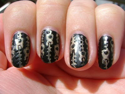
Nail Art: Black Leather With Gold Zippers

Hi chickadees!


I have so many new nail art ideas I want to share with you. Today, I thought we could start out with something simple. I've never tried this design before but I think it turned out pretty well. I was inspired by a leather bag with gold zippers in my Inspiration book.

You Will Need: 
A black polish (I used Confetti Nail Lacquer in 95 Black Tie)
A gold polish (I used L'Oreal Nail Color in 580 Because You're Worth It)
A matte top coat (I used Essie Matte About You)
Nail Art Tools (I used a small brush and a toothpick.)

1. Apply your base coat.
(I used Milani Smoothe Base Coat.)
2. Apply your black polish. Apply as many layers as necessary to get an opaque base for the design.
(I used Confetti Nail Lacquer in 95 Black Tie and applied 2 layers.)
3. Paint vertical gold stripes over your nail. Remember to leave enough space between the stripes to add the zipper tabs later. You could also paint one zipper at a time if you're not confident that you'll have enough space.
(I used L'Oreal Nail Color in 580 Because You're Worth It and made the stripes with a brush from an art store. You could also use a nail art brush or a striper.)
4. Paint the zipper tabs over each stripe. My style of zipper tab is a circle on top of a triangle. Remember to space your zipper tabs at different heights on adjacent gold stripes so the tabs don't overlap. Finish each tab by adding a black dot to represent the place where you would grip the zipper tab. (I used L'Oreal Nail Color in 580 Because You're Worth It for the zipper tabs and Confetti Nail Lacquer in 95 Black Tie to paint the black dots. I used my brush to paint the zipper tabs but if you're more comfortable with other painting implements, you could use a dotting tool.)
5. Make small black lines or dots on either side of the stripe (leaving the zipper tabs untouched). This will make your design look more like a zipper. It is not a necessary step. I originally didn't do this and I liked the way it looked but you will definitely get more of a zipper effect if you don't skip this step. Be careful. Don't let the adjacent lines touch or your zipper won't be connected. If you do make a mistake, just go over the gap with gold polish. (Again, I was using Confetti Nail Lacquer in 95 Black Tie.)
6. Using your most precise tool, draw three lines inside the circular part of the zipper tab as though you're making a rectangle but you don't close up one side. (Look at the swatches if this step is unclear).
7. Make sure your design is dry. This is very important!!!
8. Add your matte top coat over the design to create the leather effect. 

Note: If you don't want the gold polish to be matte, you can apply the matte polish after step 2. Then instead of painting the stripes normally, make thinner vertical stripes. Then after step 4, draw thin horizontal lines through the vertical lines, creating the same zipper pattern. You can then skip steps 7 and 8, though you should be careful and make sure that your nails are dry before attempting to do something with your hands.

MORE PICTURES

REVIEW of Maybelline Dream Lumi Touch Highlighting Concealer in Buff

Hello my little fairy lights,
I think it's finally time for me to review that drugstore staple that everyone raves about, the Maybelline Dream Lumi Concealer in Buff. I've been trying it out for a few months now so I think I can finally render a verdict.

Color: Buff is a light/medium concealer shade. I would call it fairly neutral, though it could be argued that it has a pink or brown undertone. I don't notice it on my eyes but when I swatched it on my hand and wiped it off, I realized that this product contains a fair amount of shimmer which clung to my skin like glitter (the herpes of art supplies) though it never remains under my eyes when I take off my makeup. The color is alright for me but it might be a little light so if I decide to repurchase this I might go for a darker shade. I can look a bit ghostly because of how light this is if I build it up or I don't use a tinted powder to set it.
Application: Application is pretty easy. I tend to use my fingers to fully blend it in if I'm on the go. The brush is alright, but I don't think it's very hygienic to keep using it around your eyes as it probably has the shelf life of a mascara (2-3 months). I've used it with my elf concealer brush but I don't notice a dramatic difference. Because it is a liquid formula there isn't really an issue with the product being too thick to blend out, though you should be careful about applying too much because it isn't as build-able unless you apply it in layers.
Coverage: I think the product offers light to medium coverage which is a major flaw for me. I have pretty bad dark circles so a good concealer makes a major difference in my appearance. This concealer diminishes the harshness of my dark circles but you can still clearly see them hiding under the layer of product. Also, it accentuates the bumps (I think they might be milia) and wrinkles (I'm only in my early-20s) under my eyes. Because of this, I probably wouldn't recommend this product for older people with deeper wrinkles.
Wear: The product doesn't feel heavy or sticky at all. I've mostly used it under my eyes to conceal dark circles but I've also tried it as a highlighter and around my nose where I have a bit of redness. It feels almost weightless so aren't conscious of the fact that you're wearing makeup. It starts to fade quickly (within 3 hours) whether or not you set it with powder. It doesn't completely disappear but it is definitely faded which is a problem with a product that doesn't offer full coverage in the first place. Just so you know, I wore it without a setting powder, with Make Up Forever HD powder and with my YSL Poudre Sur Mesure.
Packaging: I don't think the brush applicator is very hygienic, especially for a product that you use around your eyes. I know you can put some product on the back of your hand or use a makeup brush to transfer the product from the brush to your skin but those added steps can waste product and also increase the hassle. One of the major benefits of a product like this is how easy it is to keep it in your purse in case you don't have time to apply concealer before running or you need to do touch ups during the day. Also, you have to twist the tube to get the product out and I found that inevitably I would end up with more product that I needed. I think they should improve the way the product is dispensed to be a little less wasteful.

CONCLUSION: I can't enthusiastically recommend this product. For me it just doesn't provide enough coverage and it fades far too quickly. But if you don't have major issues with dark circles or wrinkles and you're just looking for a light/medium coverage concealer and you want a lightweight drugstore concealer, this might be worth checking out.
SWATCHES AND PACKAGING

Friday, August 2, 2013

Super Duper Market

Hi chickadees!
I haven't managed to get myself to a sample sale. Truth be told there really haven't been any sales that I've found exciting, though I do need to replenish my wardrobe. Anyway, instead of attending a sale, I traipsed over to the Super (Duper) Market pop-up. It's in the St. Patrick Youth Center beside the church (the former location of The Market NYC not to be confused with this pop-up).

I had investigated all the shops on their website the night before so I definitely had a plan. Of course there's not really much to do at each booth if you don't intend to buy the product.

I headed straight for Askinosie chocolate first. Dark chocolate is a weakness of mine. They have samples of the products they are selling. I tried the sweeter dark chocolate sourced from Davao, Philippines and the richer variety from Cortes, Honduras. I ended up getting both bars. Given the surprising depth of flavor, I probably would have picked up the other two dark chocolate varieties if they had been selling them. You can order the chocolate from their website. The salespeople are very knowledgeable about their products and are commendably committed to properly sourcing the ingredients for their chocolate and working with local farmers. 
(1 bar of chocolate = $8)
Askinosie Chocolate
Next I headed to Salty Road Saltwater Taffy. They had samples of the peppermint which was quite good but a bit strange because the mint and salt flavors were both so present. I opted for the Sea Salt Caramel Taffy. I was tempted to also get the Vanilla but I held back as I'm new to taffy and not entirely sure if I like it yet. I might have purchased another box if they hadn't run out of their samples of the other flavors. Caramel Apple and Bergamot could be good but I'm not willing to take the leap of faith. They also sell their taffy on their website. 
(1 box of taffy = $6)
La Newyorkina was my next stop. They were selling their paletas and nieves. We purchased a corn nieve (like ice cream) and a cucumber lime paleta (like an ice pop). Both were really true to the flavor of the products. The cucumber lime paleta was so refreshing I might try and recreate it with my juicer. The woman working there was very friendly and helpful.
(1 cup of nieve = $3)
(1 paleta = $4)


Finally we stopped at Brooklyn Soda Works. I don't tolerate spice well but I love that little kick of spice in ginger ale. I purchased a cup of their Apple Ginger mix which has a nice hint of apple flavor and a healthy punch of ginger. It's not overwhelming to the palate but you definitely taste the ginger. Be sure to try it first though to see if you like it. I do not recommend the lemongrass. 
(1 cup = $4)
(1 bottle with soda = $8)
(1 bottle w/o soda = $6)
(refill of bottle = $4)