Saturday, September 21, 2013

REVIEW of Zoya London With SWATCHES

Hi chickadees,
After years of watching The X Factor UK, Never Mind the Buzzcocks, Misfits, QI, and British youtubers, you would think that I would know more British slang, but I don't so... deal with it. I couldn't come up with a good opening greeting. That of course has nothing to do with the polish I'm about to review today... Zoya London.

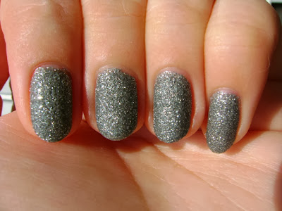
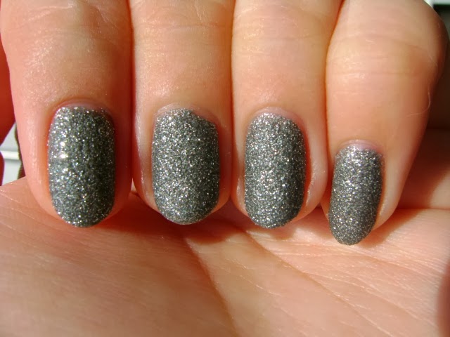
Color/Texture: Zoya London is a gray textured polish. It is part of the Zoya Pixiedust family of textured polishes. So far I have only tried Vespa and London but I would say that compared to the OPI Liquid Sand formula, the Zoya Pixiedust polishes have a much finer grit. It really doesn't feel very abrasive at all. It almost feels like a very fine grit nail file. I would say that Zoya London appears to be a fairly light gray polish in direct sunlight and appears to be more of a medium gray polish under any other lighting condition. It took me a while to really like this polish. When I saw it with my leather jacket, it won me over. You could pair a light gray with a lot of textures and colors but I think a polish like Zoya London needs a little bit of edge to really make it work. I would describe the look of this polish as shimmery concrete. The texture isn't raised off the nail that much but instead creates more of a pattern.
Formula: The formula was a little thick but easy to work with.
Application: Application was smooth with no dragging. I found the polish to be a little thick but it was easy to even out with the brush. At three coats of polish it was more or less opaque. It wasn't perfectly opaque but it looked fine and the shine and the texture of the polish concealed the lack of full opacity.
Wear: I should note that even though I wait a long time in between coats, two of my nails (left hand thumb, right hand index finger) got messed up after I had painted a third coat. There wasn't a dent in the polish but something had happened to push the polish partially down from the tip of the nail. If you can imagine one of those nail stickers being pushed down the nail, that's what it looked like. I tried to repair the damage and then I added a layer of top coat to seal the polish. I thought I'd point it out as a drying problem is an issue for any matte/textured polish.
I wore this polish without top coat (except for my thumb) on my left hand and with top coat on my right hand for give days. In that time I didn't notice any damage or tip wear and I thought that oddly enough the hand without top coat on the nails looked better at the end of five days.

CONCLUSION: I would recommend the polish if you like the look of it. Textured polishes and gray polishes are not going to be for everyone and some people might have an issue with the lack of full opacity. But I do like the look of this polish and application was easy.
SWATCHES

Friday, September 20, 2013

Erica Weiner Sample Sale Report September 2013

Hello darlings!

What? Two posts in one day? I know. I know. Try and contain your shock.

After reading Racked NY's report, I was not excited for the Erica Weiner sample sale running from today (Friday September 20) through Sunday (September 22). Friday hours are 4pm-8pm. Saturday hours are 12pm-7pm. Sunday hours are 12pm-5pm. I forgot to ask if they'll be restocking.

The sale is being held at 195 Chrystie St. between Stanton and Rivington in room 809H. It's pretty easy to locate. The 195 is painted in big green numbers over the door. But there's also a little flyer in the window about the sale and when I went, everyone was heading to the eight floor. I was right on time with the first group of about 10 people.

This sale is for a certain kind of shopper. If you're looking for big embellished Dannijo-style pieces, you'll be disappointed. If you want lockets and raw materials, you will be as thrilled as I was. I managed to walk out with a crazy haul for less than $50. I will do a haul post in the future.

Earrings are mostly in the $5 range. There is a bin you can sort through full of discontinued items. I picked up three pairs of earrings, a pair of mesh ginko leaves, a pair of maple leaf studs with little fake diamonds, and a pair of birds in flight. There were also a ton of the fleur de lis earrings I showed you in my last Erica Weiner sample sale haul and some other earrings you can see in the photos.

Necklaces (pendant and chain) were mostly in the $25 and up range. I think I saw one or two pieces for $75 but I wasn't paying much attention as I was more interested in the pendants sans chain. I personally think that the more expensive pieces were the weakest. There are no talons or bird skulls. It's mostly items you could DIY if you had the materials.

As for what I'm terming raw materials, there were small bags of crystals and lots of pendants and charms that you could just string on a chain or a ribbon or use to make more complicated pieces. I grabbed 3 bags of the crystals for $3 each even though I have no idea what I'm going to do with them. I'm sure I'll think of something. People were jealous. I also bought a lot of lockets. There were simple small, unembellished lockets at $1 each, cute little textured box lockets for $2, and heavily embellished larger lockets for $3. To give you some idea of the discount, I bought the exact pendant that was being sold on a chain at the last sale for $25 for $3 at this sale. I know. I know. There was also a big jar of heart (haha, I know it's the title of a Christina Perri song) pendants with a key shaped cutout and the words "He Who Holds the Key Can Unlock My Heart" being sold for 50 cents. I bought a locket at the last sale with this charm as well as a locket for $25. There were little gold mesh bows. I also picked up some random items like a tarnished key for $2, a saint pendant, and a porcupine quill for $1. Altogether it was a pretty productive day. You'll have to decide for yourself if the sale is worth attending but you had better decide quickly because the sale was pretty busy as I was leaving.


Emmy Awards Nail Art

Hello chickadees!


I personally find the Emmy's to be one of the most boring awards ceremonies of the lot. The Emmy's doesn't have the amazing performances of the Tony's (though fingers crossed given the return of Neil Patrick Harris as the host) or the prestige and glamour of the Academy Awards. I usually just watch the red carpet and then watch part of the telecast and turn it off sometime in the middle.

But this year I decided to make things a little more interesting for myself by doing a nail art look in tribute to some of my favorite shows. No, there will be no Breaking Bad, Mad Men, Boardwalk Empire, or Game of Thrones themed looks. I always intend to watch shows like that but I'm not paying for HBO or Showtime and my DVR is full of old movies that air on TCM so I mainly watch whatever is available on hulu.

So what shows will I be celebrating? Gossip Girl, Smash, Glee, and Nashville, of course. ;)

I used two brushes to complete all of these looks. I used my regular nail art brush which I picked up at my local art supply store as well as a new brush that I cut into a striper brush for detail work. I used the striper brush for all of the text.

By the way, if you want to know any more about the polishes I used, except for Revlon Vixen, all of the polishes have been reviewed on my blog. You can of course substitute any colors you'd like if you're going for a different look or if you have different but similar colors in your collection.

Of course, I started with a rough sketch of the design. I had planned to also do the Emmy statue but there was no way I was going to fit it on my pinky.


Gossip Girl Nail
sunlight/afternoon 

This is going to be the easiest look to execute as long as you can manage the writing. You are going to be mimicking the logo of the show with the NYC skyline at night and the name of the show.

Polishes used: Confetti Black Tie, Zoya Trixie, L'Oreal Because You're Worth It, Zoya Purity, Zoya Pippa, Essie Avenue Maintain, Essie Jelly Apple
photo tutorial

1. Start by painting a black nail polish over your nail as a base. I used two coats of Confetti Black Tie.
2. Dot a pattern of the city lights at night over your nail. I used the first image that came up when I searched "Gossip Girl logo" in google image search as a reference. You can go in whatever order you want, but I started with white dots using Zoya Purity. I then added yellow dots using Zoya Pippa. I then added some blue dots with Essie Avenue Maintain. And I finished with some red dots using Essie Jelly Apple. You are going to want the yellow and white dots to dominate as the red and blue will be quite bright. If you use too many blue and red dots they will overwhelm the design. Try and keep the design fairly sparse. Remember, you have to write the name of the show over this design and you want a lot of negative space so the letters will pop.
3. Write gossip girl. I used Zoya Trixie for this as it is one of my brightest polishes and it has a lot of sparkle. If you don't have a polish like this you could use a pigmented pastel polish but you'll have to be careful about which color you choose because it could very easily blend into the white dots. Try to use very short strokes when you are writing the letters. Remember, you're using a detail brush, not a pencil. You don't have a lot of control over the brush, especially if you're using a brush with softer bristles. Also remember to elongate the vertical line on the "p" like in the logo. Be sure to turn your nail when you are writing and use the entire surface of your nail. Unlike a piece of paper, your nail is curved. By starting at the edge of your nail, you'll be able to fit all of the letters more easily.
4. If you have space on the nail, you can write in XOXO. I used L'Oreal Because You're Worth It.
5. Seal your design with a quick-drying top coat. I used Seche Vite.
shade/early morning light

Wednesday, September 18, 2013

Kate Spade Surprise Sale

Hi chickadees,
Quick post today. I just wanted to let you know (in case you don't get emails from Kate Spade in your inbox) that there is a surprise online sale going on right now. I've selected some of my favorite items from the sale so you can get an idea of what's being offered. The sale will run until tomorrow (9/19) at 11:59pm PT.

http://surprise.katespade.com/on/demandware.store/Sites-KateSale-Site/en_US/Search-Show?cgid=ks-view-all

Sunday, September 15, 2013

REVIEW of Sephora by OPI Leaf Him At the Altar With SWATCHES

Hello my lovely dryads,

Can you believe that this is the first Sephora by OPI polish I'm reviewing? I certainly can't considering the fact that Sephora is one of the first places I started shopping when I really got into makeup. Anyway, if you follow this blog, you'll know that I picked this polish up in a recent Sephora haul when it was on sale. As far as I know, it's still on sale so keep reading to see if I think you should purchase a bottle of your own.

Color: Sephora by OPI Leaf Him At the Altar is a bright, leafy green shimmer polish. I know it's a bit simplistic to call it a leafy green when the polish has the word "leaf" in the name but I can't think of a more apt description. I think it's a gorgeous color and it's very flattering for my skintone. I think this is a polish that would work for a lot of people.
Formula: The polish is on the thinner side and has a liquidy consistency.
Application: Because this is my first Sephora by OPI polish I'll go into a little more detail than I usually do. The brush is long and thin. That is perfect for me because I have never understood the love for wide brushes (e.g. wet n' wild, Sally Hansen). Maybe it's the shape of my nails but I find wide brushes awkward to use. Application was very smooth. Because of the thin, liquidy consistency the polish just glides effortlessly over the nail. The brushstrokes are a little bit visible because of the finish but after I added top coat I didn't really notice them that much. This isn't like a frost polish where the brushstrokes are very apparent. I don't go over the polish too much or try and work with it but you could definitely do that with this polish. It's easy to work with to achieve even coats and I didn't have any issues with the brush dragging. I applied three coats to get this polish opaque. However, when I did the light test (holding my nails up to the light) I noticed that there was still a little bit of balding. It wasn't noticeable except when I was doing the light test especially with the shimmer so I just left it at three coats. Application was just as easy when I was painting with my nondominant hand.
Wear: I wore this polish for five days with no signs of wear.

CONCLUSION: I would definitely recommend this polish. I have had to restrain myself from buying another bottle while it's on sale. The formula is a little on the thinner side but the color is gorgeous and the polish applies very easily.
SWATCHES

Saturday, September 14, 2013

Updated Polishes to Review

OPI: Peace & Love & OPI, Alcatraz... Rocks, Goldeneye, You Don't Know Jacques
Essie: Going Incognito, Mesmerize, Sand Tropez, Beyond Cozy (sale), Stroke of Brilliance (sale), A Cut Above (sale), Licorice
Joe Fresh: Hunter, Denim, Persian Blue
Zoya: Dahlia, Chyna
Julie G: Shimmer Island, Cabana Boy
elf: Coral Dream
L'Oreal: Eiffel For You, Stroke of Midnight (sale), Amazon's Flare (sale), Sweet Nothings (sale)
Sally Hansen: Blue Streak, Big Money, Glitz Gal, Good to Grape
China Glaze: Call of the Wild, Manhunt
Confetti: Just Dance, Crimson Cutie, Tazmanian Devil
Color Club: In the Limelight (sale), Chelsea Girl (sale), New Bohemian (sale), Factory Girl (sale), Pucci-licious (sale), OCRF Teal (sale)
Absolute Magnetic Enamel: Or
Milani: Pool Party, Bolting Blue
Wet n Wild: Tropicalia
Sephora by OPI: Flurry Up!, Beam Me Up Hottie, Indi-go with the Flow, Traffic Stopper Copper, Havana Dreams
Revlon: Vixen, Posh
Sinful Colors: Snake It Out, Song of Summer

Friday, September 13, 2013

September Ipsy Bag

Hi chickadees!

I got my first ipsy bag in the mail yesterday and I am very pleased with it. I was so unhappy (and lazy) that I never got around to showing you the two Birchboxes I received before cancelling my subscription but without even trying the products, I can already say that ipsy has won the contest.

Before I get into this, I should let you know that I wrote this late at night so instead of dashes of insanity, you're getting buckets. You're welcome.

The makeup bag that the products come in this month is super cute. It's a medium blue bag (looks darker than the picture in person) with a black lace print and ipsy written on the little circular zipper tab. It's not the highest quality makeup bag I own but it doesn't feel super cheap and I can definitely find a use for it.

I think my favorite item in the bag is a NYX single eyeshadow in Navy Blue. I'm not sure if I love the color. I'll have to think about how to incorporate this into my routine given the way I usually keep my eye makeup simple with colors like MAC Naked Lunch or wet n' wild Nutty. I know. I've gotten boring. Maybe this new eyeshadow will help me change things up a bit. And before you tell me that I should use it wet as an eyeliner, I'm committed to my dark black gel liners. OK, that's kind of a lie but don't contradict me. I would not call this a navy blue. It's a bit dustier and duller. I think of navy blue as a more intense color. It is slightly shimmery but I haven't tried it yet to see if it applies shimmery.

REVIEW of Essie Butler Please With SWATCHES

Hello chickadees,
Today I'll be reviewing another blue polish for you. I know. I know. You've probably already seen reviews of Essie Butler Please or one of the bajillion comparison posts comparing it to all the other blue polishes including Nails Inc. Baker Street. I'm thinking of doing this peacock nail art look and PolishAholic reports that Baker Street is brighter than Butler Please and from the swatches I've seen, I think it could be the perfect blue of a peacock's body. But I'm not sure that's enough to justify buying a very similar bottle of blue polish. Why am I telling you this? I don't know. On with the review!

Color: Essie Butler Please is a medium blue creme polish. I think it's just a touch off from what I would consider primary blue. It's a little dustier. I want to say it has purple in it but that's a lie. It just has this look of a primary blue that is slightly faded.
Formula: Eh. See the application section.
Application: Where to begin? OK, let's take this one hand at a time. Painting with my dominant hand, I did a thin first coat on the nails of my left hand. The first coat was smooth but not even. The coat was too thin to really get coverage and the polish applied patchy. The second coat still applied smoothly. I noticed that the polish looked a bit odd at this point. It wasn't drying matte but it wasn't shiny either. I then applied a third coat as the polish wasn't fully opaque. The polish got a little gloopy at this point. I could tell that my nails were not perfect without top coat. It might have been the weird finish but the top coat made the polish look noticeably darker. Painting with my nondominant hand, something happened to the polish. The temperature of the room hadn't changed and I really have no explanation for why this polish lost its mind. The polish got very thick and started threading. What I mean is that as I pulled the brush from the bottle long "threads" of polish clung to the brush. It was very hard to get even coats of polish. The brush started dragging and the polish was a thick, gloopy mess.
Wear: I wore this polish for five days. I was unable to wrap the tips of my nails on my right hand (for obvious reasons) and experienced a tiny bit of tip wear. Also, the polish looked a bit dull. I never refresh my polish with top coat but this might be a polish where you would need to do so to keep it looking shiny.

CONCLUSION: I don't know. This would have just been an OK but not great polish if I had only done my left hand. But for whatever reason it became a mess when I tried to paint the nails on my right hand. It's a nice color but it is dupeable and personally I still have my eye on a brighter color like Nails Inc. Baker Street might be. So I can't recommend this polish based on my experience.

SWATCHES

Tuesday, September 10, 2013

Ritual Vintage New Store Opening

Hi chickadees!
Yes, I'm back with another sample sale report. Sort of. It's really a store opening but let's just go with it.

As much as I love Mulberry, there was no way I was waking up early to go stand in line with the rest of the crazies after I read Mizhattan's post about the VIP preview last night (criminal when there's no restocking) and lack of Alexa's and Bayswater bags in the kind of subdued colors and gorgeous leathers I prefer.

So instead, I headed over to the new Ritual Vintage storefront located at 167 Mott Street. I was there for quite a while trying things on so I ended up talking to the three or four girls working there who rotated out. They were all sweethearts. I found out that they had been busier that morning but they will be restocking frequently as this is a permanent storefront, at least for a year. The store uses a sticker system with different colors corresponding to different prices. The range is generally $20-$50 though there are some pieces at the back on the store (on the side of the register opposite the door) which are in the $100 range.

I saw a lot of great 50s and 60s silhouettes but there were items as far back as the 1930s. This is true vintage shopping. For those of you on the lookout for designer items, I found items from Escada, Kors, DKNY, Ralph Lauren, and Bottega Veneta. There is also a large range of items including blouses, skirts, gowns, dresses, one pair of studded jeans, jackets, belts, and handbags. I also noticed quite a few pieces with animals like tigers, cats, zebras, and deer.

A lot of the clothing didn't have size tags so I mostly have to go on what I tried on, but I would say that the selection favors smaller sizes. If you're above a size 10, you might have a little trouble finding items that fit.

It's hard to say if it's worth going by for the general shopper. The deals are definitely great but you'll have to make the call for yourself when it comes to the merchandise. There are some great standout pieces but these kinds of clothes aren't for everyone.

Sunday, September 8, 2013

REVIEW of Zoya Blu with SWATCHES

Hello bluebells,
How are you all today? I'm fine. That's a lie. I'm feeling awful and a little bit sick. It seems like the perfect time to try and lighten my spirits by reviewing the lovely Zoya Blu.

Color: Zoya Blu is a light blue creme polish. I don't have a complex lexicon for describing light blues. I would call it a pastel though it can also look a little dustier and darker than a sweet baby blue.
Formula: The formula is on the thicker side.
Application: Let's talk about painting with my dominant hand first. The first coat was a little streaky but application wasn't too bad. I decided that it was better to use thicker coats which made application pretty smooth. I quickly figured out that this is not a polish you should try and work with. That is, don't try and even out each coat with your brush because the brush is going to drag through the polish. With the second coat, I still saw some balding during a light test so I went in for a third coat. I kind of wish I hadn't done that. Although three coats got me to full opacity, the polish seemed to get more gloopy. I still got decent results when I worked slowly and carefully, trying not to work with the polish and using sufficiently thick coats. However, I won't pretend it wasn't difficult. Also, I did my nails at night and even though I waited for the polish to dry in between coats and added Seche Vite, when I woke up, the polish on my middle nail was messed up. It was very aggravating. Still, unsure of how to review this polish, I decided to tackle painting with my nondominant hand the next day. I found that the polish behaved in a similar manner. It was still streaky and difficult to get even coats. And even worse, this time I found that the polish was threading (as I drew the brush from the bottle, the polish clung to the brush creating a "thread") and the thick coats were hiding bubbles.
Wear: I wore this polish for 5 days with no signs of wear.

CONCLUSION: I am still incredibly confused. I love the color of this polish so much. But it is very temperamental. I can't recommend it to you based on the formula but if you can find the magic spell that makes it behave, I love the color enough to suggest that you give it a try.
SWATCHES

Sunday, September 1, 2013

REVIEW of Maybelline Color Show Nail Lacquer in 200 Pink Shock With SWATCHES

Hello my little lightning bolts,
The real shock of Maybelline Color Show Nail Lacquer in 200 Pink Shock is that it isn't pink. Oh, and I'm pretty sure it's a jelly. Yeah, I was shocked too.

Color: Maybelline Pink Shock is a reddish pink jelly polish. Yes, contrary to what you might believe from my swatches, Pink Shock is in fact a red-leaning pink and not a red orange polish. Is anyone surprised that this one was difficult to photograph? Like Essie Watermelon I think it's very easy to mistake this polish for red. I would say that maybe 5% of the time when I already know that it's supposed to be pink it appears pink to me. This was a disappointment given the bright pink color of the polish in the bottle. The other 95% of the time, I would call this either a bright cherry red or a basic red in dim lighting. Even though this doesn't have the squishy look of some jellies, I did get visible nail line and this appears to be a polish that isn't supposed to be fully opaque. It has a very juicy look like lip gloss or candy.
Formula: The formula is very thin and liquidy.
Application: Application was super smooth. The polish was very easy to work with and application was perfect. It was very easy to get nice, even coats. At two coats the polish wasn't opaque but the coats were perfectly even. It was then that I started to suspect that this polish might be a jelly. Three coats increases the opacity but really there isn't too much of a difference between 2 and 3 coats. As this polish is probably a jelly, you're still going to get visible nail line no matter what you do. Unless you go crazy and paint 4 or 5 coats or put a base color underneath it.
Wear: I wore this polish for 6 days. There was some growth at the cuticles, a tiny bit of tip wear, and one barely noticeable chip at the end of 6 days.

CONCLUSION: I would absolutely recommend this polish. You might be disappointed that it isn't a bright pink but I think if you know what you're going to get, you will be impressed with the formula. I've had some issues with the Maybelline Color Show formula in the past but I thought this one was perfect. I should note that you definitely need top coat as this polish doesn't have a lot of shine on its own.

SWATCHES

Cartier Inspired Orchid Nail Art

Hello my little flower buds,

Today I'm going to share a nice, simple orchid design based on the design Cartier has adopted for some of its jewelry.
It's exactly the kind of thing I would pin on pinterest. http://pinterest.com/lapin20/boards/ But don't feel obligated to follow me there. I'm not one of those bloggers who is obsessed with integrating all my platforms.

I've had a sketch ready for a while but it wasn't until I swatched Zoya Blu that I thought it would provide the perfect backdrop to test out this nail art design.
These are two photos of my original sketch after I colored it in with the polishes I ended up using.

Now, you know I'm technologically challenged so I don't make videos and I wouldn't know where to start with gifs. But I decided to try and break down this design as best as I can in a series of photos.

This line by line tutorial should allow you to replicate the outline of the flower. You are going to start by drawing the outline of the flower in black. (I did all the painting with a small paintbrush I purchased at an art supply store.) Do not worry about getting it perfect. If the lines are a little thicker than you would want them to be in the final design, do not worry. Mostly focus on getting the outside of the edges of the lines to look the way you want them to.
This is how my nail looked after I finished my outline in black. I used Confetti Black Tie. I like it because it's a smooth black that doesn't get gloopy and it's fairly opaque. 
Next, I went in and filled out my outline with Essie Penny Talk. You can see how I went in and covered up some of the black outline, ending up with a thinner line. 
I next went in and drew a teardrop with Confetti Black Tie and then filled that teardrop with OPI AntiBleak. This step is optional and if you decide to do it you can use whatever color you like. You can stop here but...
I wanted to replicate the Cartier Orchid so I added a piece of holographic hex glitter from my bottle of Sephora by OPI Beam Me Up Hottie!. I chose the holographic glitter because it really catches the light and reflects back interesting colors. I believe in using whatever you have around. You could use glitter from any bottle of glitter top coat, loose glitter, a nail art rhinestone, or even a silver polish like Zoya Trixie. Be creative and have fun!

MORE PHOTOS OF THE LOOK