Thursday, July 25, 2013

REVIEW of Maybelline Color Show Nail Lacquer in 190 Coral Crush With SWATCHES

Hello chickadees,
I am once again tasting the bitter sting of failure for being unable to come up with a cute greeting that references Maybelline Coral Crush. Oh well. As far as I know, this is part of the permanent collection though the Maybelline displays always seem to be a little ransacked at the NYC drugstores I go to so I can't guarantee that you'll always find this color at the store.

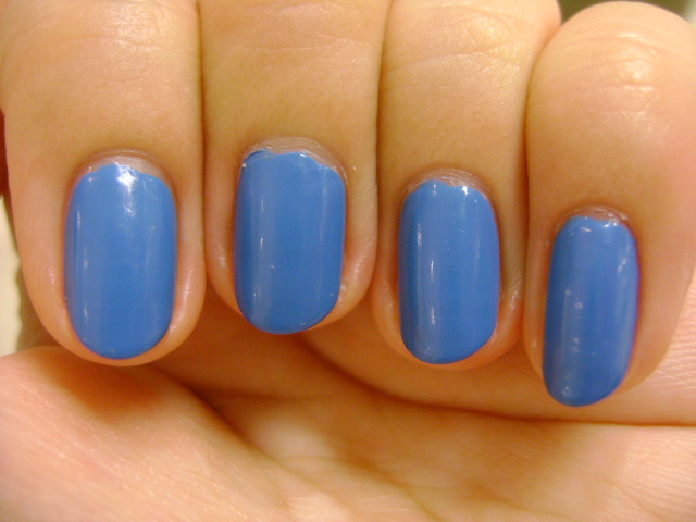
Color: Maybelline Coral Crush is a bright pink creme polish. Indoors, it can look very orange, especially as the day wears on and there is less natural light coming in through the windows. Sometimes you do get that perfect guava/coral color but for the most part, I think this color is more of a hot pink (much to my disappointment). Don't get me wrong, it's a very pretty color that I find flattering (when it's not orange) but it means I'm still on the search for a perfect coral polish.
Formula: The formula is thin enough to go on smoothly but not watery.
Application: The first coat went on smoothly but not evenly. The second coat was about the same. The third coat was still not completely even or fully opaque and you could see where the brush strokes overlapped. I ended up painting a fourth coat to clean things up but you could get away with three coats. Any bubbles you see in the swatches are from my Seche Vite. I really need to get a new bottle.
Wear: I wore this polish for 5 days without any signs of wear (not that I ever really get signs of wear except with the bad polishes).

CONCLUSION: I can't give this polish an enthusiastic endorsement but I like the color so much that I will tentatively recommend it in spite of the application issues.
Cat is a participant in the Amazon Services LLC Associates Program, an affiliate advertising program designed to provide a means for sites to earn advertising fees by advertising and linking to amazon.com. If you would like to help support this site, please consider making your next purchase at amazon.com through the links on my page.
SWATCHES: 

Friday, July 19, 2013

REVIEW of OPI Can't Find My Czechbook

Hello chickadees,
I... I've got nothing. I can't think of anything cute or clever to introduce my review of OPI Can't Find My Czechbook. Heck, I don't even know if you like my attempts at humor. Hardly anyone leaves comments. Yes, I'm in a mood. Here we go...

Color: OPI Can't Find My Czechbook is an aqua creme polish. Isn't the name just precious? It may be 60% of the reason I bought this polish. I know I have a problem. Don't judge me. Anyway, I've been reviewing a lot of polishes in the blue/green color family lately which makes it a bit more difficult to describe them in a way that differentiates them from one another. To me, OPI Can't Find My Czechbook is aqua. It's clearly blue, but it has a bit of green in it. It leans more blue outdoors, and more green indoors, especially as the day goes on and the amount of natural light decreases. The color is saturated but somewhat muted and this polish tends to photograph brighter than it really is so be wary of taking the swatches you see online at face value.
Formula: The formula is liquid-y and thin. It's the kind of creme polish formula that I expect from OPI.
Application: The application of the first coat was smooth but sheer. The second coat didn't apply as smoothly or evenly. You could see where the brushstrokes overlapped. At this point it became a question of balance. You kind of have to estimate how much polish you need so there's enough polish that the brush won't drag into the last coat of polish and create streaks and not too much polish so the liquid-y formula will flood into your cuticles and create too thick of a layer. I won't say it wasn't tricky. It wasn't terrible or unmanageable but it was not my favorite formula to work with. At three coats, the polish looked fine but a light test (holding your nails up to the light) and close scrutiny revealed the uneven coverage. I wasn't too bothered so I just left it at three coats.

CONCLUSION: I would probably recommend this polish. It's not the most unique color but it's rather pretty and it would be flattering for a lot of skin tones. The formula can be a little difficult to work with but it isn't impossible. However, if you don't want the trouble, I would suggest looking for a dupe with a better formula.
 
SWATCHES

Missha Haul

Hello chickadees,

Today I decided to do a quick post sharing my recent haul of Missha products. Missha is sold at some smaller Asian beauty stores in NYC but I haven't tried anything from the brand before now (except for a gel exfoliator which I will review at a later date) because I usually stick to drugstore products or Sephora products that get a lot of buzz. But you know I can't resist a great sale.

I placed my order on July 3 and received my order on July 18. Apparently one of the items I had ordered was out of stock which somehow caused a tremendous delay in the shipping of my order. Missha packages things old school with packing peanuts but I have to say I love the design of their products. Let's take a look.

I can never resist the promise of a good concealer. This one had some good reviews so I decided to just take a risk and try it out. 
The packaging is very pretty...
...though a bit wasteful given how much of the container actually contains product.
I swatched the product. It seems very creamy though it might be a little light for my complexion. We'll see how it works out. I'm not quite sure why the product is tilted to the side like this. 
Longtime readers will know that next to concealer, mascara is the other product I struggle with. Generally I have the best luck with L'Oreal but I couldn't resist the chance to try one of these vibrating mascara wands when one of my number one complaints is how so many mascaras uncurl my lashes once I apply them.
I did a brief test. The mascara wand has two settings and it does vibrate. I'm a bit wary of putting this near my eye so I'll probably finish off my current mascara before testing this one out. You can also remove the cap and presumably switch out the battery. If this works well I might wash off the brush and keep it as a makeup tool and buy replacement batteries to power the wand. But I'm getting ahead of myself.
It comes with a simple wand with plastic bristles.

Thursday, July 18, 2013

REVIEW of Essie Where's My Chaffeur With SWATCHES

Hello my lovely social butterflies,
Today I have a polish that certainly sounds like it belongs in your collection: Where's My Chaffeur from Essie's Winter 2012 collection. However, I don't think this polish will meet the standards of any high maintenance types. Why? Well, I am a glad you asked, imaginary voice of the audience.

Color: Essie's Where's My Chaffeur is a turquoise green creme polish. It's in the blue green family of colors but it definitely leans more towards the green side of the spectrum. That was a little disappointing for me as this polish appears quite blue in a lot of swatches online.
Formula: The formula is smooth and has a liquid-like, thinner consistency.
Application: The first coat was smooth. On the second coat the brush was a little streaky and dragged through the polish. On the third coat, I still found that the brush was dragging through the polish so I would recommend using thicker coats just to avoid this. At three coats, this polish still failed the light test because of the uneven application but I was not about to add a fourth coat. I added 2 coats of Seche Vite in an attempt to smooth out the polish. My Seche Vite is already starting to thicken up so any bubbles in the swatches are from the Seche Vite.

CONCLUSION: I am very disappointed with the formula of Essie's Where's My Chaffeur. There are some polishes that make it look like you can't do your nails. This is one of those polishes. I would have also preferred a color that was a little more blue than green. It should be easy to find a dupe or a very similar polish so no, I would not recommend Essie Where's My Chaffeur.
Cat is a participant in the Amazon Services LLC Associates Program, an affiliate advertising program designed to provide a means for sites to earn advertising fees by advertising and linking to amazon.com. If you would like to help support this site, please consider making your next purchase at amazon.com through the links on my page.
SWATCHES

Thursday, July 11, 2013

Random Shopping Pictures From Germany

Hi chickadees,

I didn't have a lot of time for shopping in Germany as I was with a tour and most of my free time was spent looking for places to eat or sightseeing. However, I did manage to squeeze in a little bit of shopping time which I've captured in the following photos.

I entered KaDeWe to browse through their shoe department. The only shoes I'd brought with me were my sandals and all those cobblestone streets were creating a safety hazard. I tried on a pair of cute shoes at repetto, and while I loved a lot of the styles, if you know anything about me, you know I have issues with flats and closed-toe shoes. 
Repetto

Wednesday, July 10, 2013

REVIEW of Zoya Purity With SWATCHES

Hello my darling little snowflakes,

Because the world has gone mad and a 1960's mod trend has come and gone and come again, apparently white nail polish is "in" again. And so today I'm jumping on the bandwagon and reviewing Zoya Purity for you.

Color: Zoya Purity is a white creme nail polish. There's not much to say besides that. It's a basic stark white without any shimmer. It doesn't lean towards a cream or ecru with yellow or brown undertones. It's just a nice, basic white nail polish.
Formula: The formula is a little bit thick. It's a little gloopy and elastic and clings to the brush.
Application: The first coat was a little bit streaky but that's not really out of the ordinary for most polishes. On the next two coats (I used three coats in all to get this polish to full opacity) I found that the brush dragged and there were a lot of bubbles. The overlapping brushstrokes were also very apparent.

CONCLUSION: I am very disappointed in this polish. I think it will be useful to have a white polish in the future and it's a nice basic white but the formula was pretty bad. I liked the way the color looked on my nails but I could not get over how bad the application was. I am still on the lookout for a good white nail polish.
SWATCHES

Sunday, July 7, 2013

REVIEW of Zoya Vespa With SWATCHES

Hey cool riders,
I have a new textured polish formula to introduce to you today. Zoya Vespa is part of the new line of Zoya Pixiedust polishes. OK, so they're not brand new, but I was waiting for a Zoya promotion before purchasing a few of them. I also have London and Dahlia which I will probably review in the fall.

Color: Zoya Vespa is a light green textured polish with silver glitter. It's a light cool-toned green without top coat and more of a muted spring green with top coat. As a textured polish, Vespa has a very fine grit. It's a bit abrasive against your skin but I don't think it's even as abrasive as a mild exfoliant. To me, it appears to be more of a gritty matte glitter polish than a textured polish except in direct bright sunlight. You may see some swatches on other blogs that make the texture seem more pronounced but a lot of those photos are extreme close ups. In person, the texture is less noticeable. However, there is a slight difference between the look of this polish with and without top coat. The color is slightly darker and more intense with top coat. Obviously, the use of top coat provides shine and smooths the surface of the polish. And the glitter appears less gritty and more like it is trapped. It's clearer in the swatches. I think this is a color that would flatter a lot of skin tones but it is especially nice if you have yellow undertones as I do.
Formula: The formula is difficult to evaluate. The polish clung to the brush like a thicker polish but it was very sheer.
Application: The polish feels a little thick and my brush seemed a little wonky but application was still smooth. In one coat, the polish was already very sparkly but sheer. the first coat dried very quickly (almost like a basic matte polish) but with successive coats (especially if you're using thicker coats) you should let your nails sit for a while to completely dry. In two coats, I still saw balding and the polish was still somewhat sheer. In three coats, there was still balding and patchiness and the polish failed the light test but at that point I didn't care to keep layering on coats.
Wear: The polish is pretty smooth for a textured polish but it is still slightly abrasive so I would be careful about maybe scratching your skin or expensive articles of clothing. Chances are, it won't be a problem but it's better to be cautious. As I wore it I did get a bit annoyed with the patchiness.

CONCLUSION: I would recommend this polish. It is sheer and still patchy in three coats but I think the color is flattering and the textured effect is nice, if subtle. This is probably a polish that you should layer unless you feel like waiting for 4 or 5 coats of polish to dry.
SWATCHES

Wednesday, July 3, 2013

MISSHA Sale

REVIEW Essie Maximillian Strasse-Her With SWATCHES

Hello peanuts,

It has taken me forever to review this polish because I took so many swatches that I then had to comb through for color accuracy. Why? Because Essie's Maximillian Strasse-Her is a very odd polish. A large part of why I bought this polish was due to its popularity when I pinned it to my Pinterest board of Nail Polish Swatches. I think perhaps that's part of the reason why I'm not crazy about it. It wasn't one of those polishes I obsessed about for a long time before I purchased it.

Color: Where do I even begin? Essie Maximillian Strasse-Her is a light green creme polish. No. It's a gray creme polish. No. It's sort of both. And, no I don't mean that it's a duochrome. I don't really find the color appealing. I prefer Essie Sew Psyched or Essie Da Bush or just a gray creme polish. The particular mix of greenish gray that is Essie Maximillian Strasse-Her just doesn't seem very pretty or odd enough to visually interesting.
Formula: The formula was a little thick.
Application: The first coat was very smooth but I found the polish to be a little thick and streaky on the second coat. The brush also dragged a little but that was only an issue on my thumb. If you use thicker coats, you should be able to get away with two coats of polish. If you use thinner coats, you will need three coats to reach full opacity. I used a slightly thinner first coat on my pinky so I ended up needing three coats on that nail. I'm not sure if it made a difference in application but it was very hot on the day I was painting my nails. When I did my right hand (painting my nondominant clumsy hand) I also used two coats but I found the streakiness much more apparent and I could definitely see the bald patches when I held my nails up to the light. It was a little cooler that day and the polish still seemed rather thick.

CONCLUSION: Personally, I don't feel like this is a polish I need in my collection and I had some trouble with the formula. However, if you like the color, the formula is manageable if not enjoyable to work with.

SWATCHES

Tuesday, July 2, 2013

REVIEW of Essie Avenue Maintain With SWATCHES

Hello chickadees!


Today I decided to review the other polish I wore during my trip, Essie Avenue Maintain. Silly me, I brought all my manicure supplies except my Seche Vite so I spent the first few days of the trip looking for a store until I finally settled on a bottle of Art Deco 913 Speed Dry Top Coat. Thank goodness it worked better than all the non Seche Vite brands I've tried in the US (Sally Hansen, Revlon, Rimmel, etc.). I may eventually review this top coat (which I've used three times so far on a manicure and pedicure for myself and a pedicure for my mom) but I just wanted to let you know I used it for this manicure in case there's a noticeable difference in the way the polish looks (but there shouldn't be).

Color: Essie Avenue Maintain is a medium blue creme polish. I like to think of it as a cornflower blue but it might be a shade or two darker depending on your definition of cornflower blue. Like any blue polish, it provides a pop of color but it's not as bright as a neon or a royal blue while not being as safe as a pastel. I think it's a good color for someone who wants to take a risk with color without calling too much attention to their nails. It adapts to the outfit you pair it with. It's a very difficult blue to photograph so I suggest you look at a lot of swatches online. It tends to photograph lighter than it really is.
Formula: The formula is smooth but on the thicker side for an Essie polish.
Application: I used two coats because I was on vacation and in hotel rooms and feeling lazy. In two coats there was a little patchiness but nothing that bothered me and I'm sure three coats would have been perfect. Application was pretty smooth. It wasn't as good as some of my perfect Essie formulas but I had no major complaints.

CONCLUSION: Yes, if you like the color, I would recommend this polish.
SWATCHES

Monday, July 1, 2013

Blue Nail Polish Comparison: Essie Butler Please, Essie Mesmerize, Zoya Natty, Essie Bobbing For Baubles, China Glaze Man Hunt

Hi chickadees,

I know you love it when I do nail polish comparisons and a friend of mine recently told me she was thinking about doing some TARDIS nail art so I rounded up the darker blue creme polishes in my collection to compare them for you. This experience taught me that blue polishes can be a pain in the arse to photograph and that for some reason putting one blue next to another can make it look very different. I've reviewed Essie Bobbing for Baubles and Zoya Natty on this site before and they never seemed this dark.

Anyway, as a reference... (I used 3 coats of each polish.)
Thumb: Essie Butler Please
Pointer: Essie Mesmerize
Middle: Zoya Natty
Ring: Essie Bobbing for Baubles
Pinky: China Glaze Man Hunt

This in an indoor lighting shot taken with my new camera. It's the most color accurate of all the photos. The only nail that isn't color accurate is my thumb because the bright blue of Essie Butler Please made my camera a little crazy.
This is what Essie Butler Please actually looks like.