Thursday, January 31, 2013

Update

Hello my lovelies,

Gosh darn it, I'm dealing with another lip allergy. I'd been testing out Eucerin Aquaphor Lip Repair (which I happen to really like... review coming soon) and I finally felt like my lips looked and felt ready for product testing again. Well, I swiped on Maybelline Colorsensational Lipstick in Fifth Ave. Fuchsia, a color I've been wanting for the longest time, and a day later my lips started to sting and feel tender. Two days later and I'm noticing a little roughness. Hopefully it'll clear up soon. When it does, I'll give the lipstick one more try, at least long enough to do a swatch for you and if I get the same reaction, I'll sadly have to toss it. Or find a way to use it in an art project but I'm not sure how I'd be able to use lipstick. It seems crazy to me that I seem to be having this reaction to Maybelline lipsticks when I've tried them in the past without any problems. Maybe it's a new formula or certain colors? I have no idea. Anyway, if you're wondering why there still aren't more lip product reviews, this is why. I do have some more nail polish reviews coming your way so stay tuned for that. My last semester of college is looking like it's going to be pretty busy but I'll always make time for you.

-Cat

Wednesday, January 30, 2013

REVIEW of Zoya Blaze With SWATCHES

Hello darlings,
I have found yet another Zoya polish that I'm rather thrilled with. Its name is Zoya Blaze and it is quite a stunner. Indoors, it reminds me of Dorothy's ruby red slippers. While this color could be appropriate for Christmas, to me, these are year-long diva nails that demand attention.

Color: Outdoors, Zoya Blaze is a deep pink polish with pink and red and gold shimmer. I have seen it described as a holographic polish but not having much experience with holographic polishes, I can't say for sure if that is what this is. Indoors, Zoya Blaze is a beautiful ruby red polish with red glitter.
Formula: Great formula. Opaque in 2 coats.
Application: Zoya Blaze wowed me from the start. From the first coat, there was already so much shimmer/glitter. Each coat darkens the polish and increases the amount of glitter in a way that makes me almost want to layer this polish so I can hang onto the brighter red and the more subtle glitter distribution. At 2 coats the amount of glitter is so blinding that even if it hadn't already been opaque, I wouldn't have wanted to add a third coat.

CONCLUSION: I would absolutely recommend this polish. It is a beautiful color, the glitter/shimmer/holo gives it a lot of depth, and it's opaque in 2 coats and very easy to apply. What more could you want, right?

SWATCHES

Friday, January 25, 2013

REVIEW of Zoya Lael With SWATCHES

Hello chickadees!
Are you sick of purple nail polishes yet? I'm a little sick of them. What can I say? I'm mad for a color and then when I'm over it I realize I still have three bottles of that same color to test. Yes, I have a problem. But diagnosing my nail polish addiction is not the purpose of this post. What is the purpose? Reviewing Zoya's Lael polish.

Color: Zoya Lael is a reddish purple creme polish. It's possible I would have liked this color more if I didn't already feel like I had dupes or polishes similar enough that I didn't really need this one. I was expecting it to have more red and be a little more vibrant but instead it reminded me of something like Essie's Carry On. In dim indoor lighting it can look very dark. Sometimes I can still tell it's purple but sometimes it looks black.
Formula: The formula was not great. It was a bit thick and as I was painting I noticed tiny, short threads forming. That is, as I pulled the brush out of the bottle, threads of polish clung to the brush. Now, with a terrible polish, long threads will form and those polishes are impossible to work with without making a mess of things. Because the threads were short and thin they didn't cause too much of a problem but I can see it getting worse over time.
Application: Application was very smooth in spite of the bad formula. I could probably have gotten away with 2 coats but I personally felt like I needed 3 so get a more perfected look. Also, though application was smooth, I did notice some bubbling.

CONCLUSION: I would not recommend this polish based on the formula or the color. I think it's too similar to other purple polishes with better formulas.

SWATCHES

Thursday, January 24, 2013

Thoughts on Writing: I Should Write A Manuscript

Hi darlings,

I know I haven't written one of my writing/random emotional venting posts in a while. But elsewhere on the internets I have been saying for months... who am I kidding... for years, that I should just go ahead and write a manuscript. For one, every writer says the best way to learn how to write is to just go for it. And actually forcing yourself to complete a novel will teach you more about the writing process than anything else.

It's not that I haven't written anything. I write this blog. I write articles and reviews. I write short stories. But a novel is a commitment. And as we've reviewed, committing to something is scary. Committing to something means you can fail. I don't want to realize that my potential is a "tiny, gray, starveling little cat with diarrhea..."
That would be horrifying. Putting yourself out there to face rejection is horrifying. But even worse is putting in effort before putting yourself out there and then getting rejected. It's much easier to decide to audition for something on a whim than to practice every day until you feel like you've reached the peak of your abilities only to be told that you aren't good enough. It's much easier to focus on the subjects you're good at and commit halfheartedly to those you aren't so that when you don't get an A, you can excuse it as not performing to your full potential. And it's much easier to spend time writing rambling short stories that may not be entirely internally consistent, instead of working on a full-fledged novel that you put time into conceiving and plotting and editing and then send off to publishers. Because when you experience failure after all of that, it can crush your spirit. Maybe not at all once. Nothing as dramatic as all that. But your confidence can leave you bit by bit until you're emotionally paralyzed.

But eventually you have to keep moving. And no one is going to carry you home. No matter what The Drums say. 
So I'm going to force myself to keep marching on. One slow, wobbly step at a time. It may take me some time to work out what I want to write about as I'm full of ideas but writing a novel is about finding something you seriously want to write about for months, not something you think sounds interesting that you'll abandon a quarter of the way through. Maybe I'll talk to you about my ideas. Or maybe I'll just talk to my dog. But regardless, I will keep you updated, darlings.

Thanks for listening,
Cat

Wednesday, January 23, 2013

REVIEW of Nivea A Kiss of Olive Oil & Lemon Moisture Rich Lip Care

Hi chickadees,

Listen, I'm not an expert on lip products. I just know what I like and I try my best to convey my experience with a product. First of all, I have to say that I kind of love that this lip balm is green. It isn't pigmented enough to tint your lips green, not that you would probably want it to, but I thought it was cool nonetheless. I bought this when Rite Aid was having a discount on Nivea lip balms and I couldn't resist adding this one since I love the color green.

Anyway, I suppose I should give you some basic information about the product and then launch into my rambling about whether or not I think it's effective at moisturizing.

Color: As I noted, while the product appears green in the tube it is really not pigmented enough to tint your lips. You won't be able to build up the color either.
Scent: There is a faint scent to the product in the tube but for some reason the scent is much stronger when you're applying it. If you don't like the scent, it fades for the most part once you're wearing it, but if you have a really strong aversion to scents of any kind, this might not be the product for you as I do notice it while I have it on. To me, it doesn't really smell like real olive oil or lemon. Rather, it smells like the version of olive and oil and lemon you might get from a high-end candle or a L'Occitane product. I think it's pleasant and pretty. It's bright and maybe a little grassy and it's very subtle and demure. It's not an aggressively citrus-y lemon.
Application: The product applies in a nice, smooth glide. It gave my lips a sort of slippery feel. I think it's a pretty standard lip balm. It isn't as light as some of the more useless lip balms I've tried that just feel like a bit of grease on your lips. And it isn't as heavy as the thicker lip balms I've used in the past.
Moisturizing/Drying: Here's where I get confused. When I started using this product, my lips were very damaged. They were peeling to the point that there was barely enough of the top layer of skin to cover my lips. I used this balm consistently for about 3-4 days and my lips healed. But I'm not sure if my lips naturally healed on their own or if this balm had something to do with it. I do think having a balm that kept my lips from rubbing together while they were peeling was helpful but I don't really think this product provided much in the way of moisture. Why? Well, I continued to use this product once my lips had healed. And I began to realize how frequently I felt the need to reapply. It was as though in an hour or two, the lip balm had worn away even without eating or drinking or talking. And with or without the lip balm on, my lips still felt like they were dry.

CONCLUSION: I do like the scent of this lip balm and the color is a bit of a novelty. But I don't think this is going to help much if you have very dry or damaged lips.

SWATCHES

Tuesday, January 22, 2013

REVIEW of Sally Hansen Xtreme Wear Nail Color in 310 Gunmetal

Hi chickadees,

There aren't a lot of polishes that I can only stand to wear for a day. This was one of them.

Color: I know this will come as quite a shock... but Gunmetal is a gunmetal gray polish. I would classify it as somewhere between a frost, shimmer, and a metallic polish. It kind of has the look of liquid metal with tiny flecks of shimmer. Indoors, it is a very dark gray, as in the pictures. Outdoors, it is a lighter gray but that would not photograph correctly. I added the pictures anyway just to show you how the polish inexplicably photographs blue. There is really no blue in this polish.
Formula: The formula was very thick and gloopy. And I got tons of bubbles.
Application: Application was a pain. You could see the overlapping brushstrokes (though this was not as apparent after top coat it was noticeable enough to annoy people who hate that look). It was very difficult to paint even coats and I experienced a lot of bubbling. I also found it hard to wrap the tips of my nails because the polish was so thick. I should note that the smell was particularly strong and terrible. The one positive thing I can say is that it only took me 2 coats to get this polish opaque.

CONCLUSION: No, I would not recommend this polish. The color is nice enough but it has so many formula and application problems. I know it's cheap, but I'm sure there's a dupe out there.

SWATCHES

Sunday, January 20, 2013

REVIEW of Revlon Whimsical With SWATCHES

Hi chickadees!
I feel like I start most of my reviews this way but this is another I was crazy about tracking down but apparently not about trying because it's been sitting unused with the rest of my collection for months since I bought it. Yes, I ran about rather insanely looking for Revlon Whimsical, the supposed Deborah Lippmann Glitter in the Air dupe (only to annoyingly find a lot of them at Duane Reade months later after my initial fervor had passed...but that's beside the point). You would think of Whimsical as a typical spring color but there's something a little dryer and dustier about the blue base that made me want to pull it out in the middle of winter. So, after all this time, how do I finally feel about this polish now that I've worn it? Well, I'm still not sure.

Color: Revlon Whimsical is a grayish blue polish with large pink and blue hex glitter, medium pink and blue glitter, and small pink and blue glitter particles. I'd call it more of a semi-sheer polish than a jelly because I don't really think it has a typical jelly look. It just takes a few coats to build up the color. Four coats to be exact. With three coats, I thought I had a nice amount of glitter and a relatively semi-opaque base but the polish still looked so streaky that I did a fourth coat. At four coats there was still some balding but it wasn't too terrible once I added top coat. This is definitely a polish that seems meant for layering. I liked the color. It feels light and refined, and yes, whimsical, like something you would pair with a fairy costume. Obviously as it contains so much glitter, it's not the most work appropriate polish. However, I did think the slightly dusty quality of the blue base kept the polish from being too childish.
Formula: As this is a sheer polish, the base is very thin.
Application: For all the trouble of painting 4 coats, application was very smooth. However, glitter placement was a pain in the arse. I almost always find glitter placement annoying but since this polish has a particularly sheer, thin base, it's even harder to pick up glitter with the brush unless you pick up a ton of polish. You will see indentations in the swatches below. That is my fault. I didn't wait long enough for the polish to dry in between coats and since I did 4 coats, the polish ended up a little squishy and my nails made marks in it before it fully dried. I didn't notice these until I was taking photos. I will say that it was pretty easy to fix this. There was also a lot of bubbling which I didn't notice until I saw the swatches. It's not as apparent in person.

CONCLUSION: I had mixed feelings about how this polish looked on my hands. I didn't think it looked terrible but it wasn't quite flattering either. I think it would probably look best with very pale skintones with a pink undertone or very dark skintones. If you want to wear this polish on its own, four coats is a lot of trouble and it did look somewhat streaky even at four coats. But application was smooth. I guess I'll say that if you love the look of this polish or you're really desperate for a Deborah Lippmann dupe, then this polish is worth you're time. But if all the problems I've listed have you wary, you will probably not be too happy with Revlon Whimsical.
SWATCHES

REVIEW of Sally Hansen Insta-Dri Anti-Chip Top Coat

Hello chickadees,
I am sorry for all of you out there who love this top coat and claim that it's better than Seche Vite, but it's not. #truth #facts I have been on the search for a Seche Vite replacement for a long time as it's quite expensive at NYC drugstores (I usually get my bottles from Harmon's in the suburbs). Also, while I know Seche Vite is not as dangerous as people claim (see my post on Seche Vite's response to my customer service inquiry) http://smartandsarcasticwithdashesofinsanity.blogspot.com/2012/11/seche-vite-on-seche-vite.html 
I also know that it isn't great to apply these kinds of chemicals to my nails at the frequency I do considering how often I change my nail polish color. So of course when everyone was saying that Sally Hansen Insta-Dri was a great replacement for the shine and quick-drying of Seche Vite, I threw it into my drugstore.com order to try it out. And... well...? I hate it. I hate it so much. I hate it with a passion.

First thing? It's not quick drying. I had to wait more than a few minutes for it to dry. That is a far cry from the 30 second claim on the back of the bottle.

Secondly? It's full of bubbles. FULL of bubbles. And very thick and gloopy and difficult to work with. I can't even continue to test it because it'll ruin every polish I apply it over. This is inexcusable for a top coat, which should make your nail polish look better, not worse.

Oh, and if you think that the lack of toluene or other ingredients is going to make this smell any better than Seche Vite, it doesn't. This smells just as terrible. Maybe a little bit worse.

Conclusion: Obviously, I don't recommend this product.

This is how much I used by the time I reviewed this product. I may try and find other uses for it in art projects and whatnot. Maybe if I'm in a relaxed mood I'll give it another chance, but it's doubtful.

Tuesday, January 15, 2013

REVIEW of OPI Yoga-Ta Get This Blue

Hi chickadees!

Another short review today. This time it's Yoga-Ta Get This Blue from OPI's Spring 2008 India Collection. I picked up my bottle in a haul from drugstore.com. So, do I dare compound the pun and say I think "yoga-ta" run out and buy this polish? Hmn... Perhaps. ;) Keep reading.

Color: Yoga-Ta Get This Blue is a rich sapphire blue polish with lighter blue shimmer. The shimmer gives it that gorgeous lit from within quality and a lot of depth. The color is gorgeous, sexy, and captivating.
Formula: Not noticeably thick or thin. I noticed that it dried very quickly.
Application: Application was very smooth. This polish was so opaque that it was almost opaque in one coat. It takes a lot for me to only do two coats, as I'm pretty much a three coat girl unless a polish can hold up to the light test without that third coat. There was no question about it. This polish was opaque in two coats. I will say that on the second day (I didn't have a chance to take pictures the first day) the polish wasn't meeting my shine standards for photos so I put on another layer of top coat.

CONCLUSION: Yes, I would definitely recommend this polish. The color is gorgeous and will work for a lot of skintones. Application was very smooth, it dried quickly, it was a two-coater. What more could you want? :)
SWATCHES

Monday, January 14, 2013

Journelle Sample Sale Report

Hi chickadees!


So I finally made myself leave the house long enough to attend the Journelle Sample Sale preview night. It helps that I attended an amazing concert beforehand which I unfortunately can't tell you anything about at this time (but it wouldn't really be that interesting if I could since I don't have any photos or videos to share.) Where was I? Oh, right. The Journelle Sample Sale. :)

I headed to the location, at 260 5th Avenue (b/n 28th and 29th St) pretty darn early so I beat the crowds, which was marvelous for me since it usually takes me forever to find a bra I like when I'm shopping. I managed to walk out with a $32 Natori bra (originally $64) that is actually really comfortable.

So, I think the easiest way for me to explain things will be to guide you through the layout of the space through the pictures I took.

As you walk in, you are confronted with the standard coat check. They made me check my coat and bag (even though I just brought my little baguette). I don't know if you'll have to check all your things during the actual sale or if this was just for the preview, but go prepared with pockets or some other way of holding your things just in case.
I made my way through the space in a clockwise direction starting from the left as you walk in (the direction of the coat check) and ending up at the cash register. On the left wall is where you'll find racks with the least expensive bras. Items without a sticker are 50% off. I checked a lot of the tags in this section and I found that most of the prices on the tags ranged from $45 to $90 which means you're looking at $22 to $45 bras, an amazing steal even for non-designer brands. Bras are arranged by band size (number) as you can see in the picture. I saw a lot of B's and C's in all of the racks but the cup sizes went all the way up to DD for some Donna Karan foundation bras. I didn't manage to find any A's but it's possible they were in there.
There was nothing all that wild or risque in terms of style or color selection. Most of the bras were black or nude/beige or white. There were some muted colors and a few randoms brights but for the most part, colors were more practical than eye-catching. The styles were fairly feminine and girly. There was a lot of lace but nothing I'd call daring or aggressive. The one item I spied that might raise a few eyebrows was a red bra with  a criss-crossing band pattern above the cup. I do remember seeing a few teddies but I can't remember if they were with the regular bras or in the Emerging Designers section.

Sunday, January 13, 2013

REVIEW of Revlon Emerald City With SWATCHES

Hi chickadees!
Since Pantone has declared Emerald at the color of 2013, I thought there would be no better time to swatch and review Revlon's Emerald City for you. I've had this polish for a little while now. I bought it when I was mad for Zoya Veruschka and couldn't find it anywhere. To be honest, I'm still kind of mad for Veruschka but Emerald City has appeased my craving for the time being.

Color: Obviously, when a polish is called Emerald City, your instinct is to write "Emerald City is an emerald green polish" and call it a day. And yet I hesitate as the color on my nails doesn't perfectly channel what's on the Pantone website. Nor does it really remind me of the Oz of 1939. So I will simply say that Emerald City is a deep green matte polish with little flecks of lighter green glitter. In certain lighting it almost looks like there's a bit of black in there as well. Even in dim lighting the glitter makes the polish a little more special when it catches the light. In bright lighting it gives what could be a flat polish a lot of depth. I didn't think I was going to like the finish as much as I do but it feels very chic. It reminds me of the colored leather dresses that have been popular on the runways recently though my nails feel more like paper than leather. I also tried this polish with top coat, which of course makes the color more vibrant and makes the shimmer come alive. It's very sparkly. But I can honestly say I like this polish both matte and shiny.
Formula: The formula is on the thinner side which actually makes the polish pretty easy to work with.
Application: Application was surprisingly smooth. I've been disappointed with Revlon polishes in the past but maybe they need to make more matte polishes if this is the result. I needed 3 coats for opacity. Because it is a matte polish you have to work a bit quickly but I still had a decent amount of time to event out the polish.
Wear: I've heard that matte polishes are only supposed to last 2 or 3 days before they start to chip (due to the lack of top coat) so I purposely wore this polish 3 days to test it out. On the second day I noticed very minimal tip wear but no chipping. Though I should note that my polish never chips and the worst damage I've ever gotten is bad tip wear.
Conclusion: I would definitely recommend this polish. I'm not sure about long term wear but application was easy and the color is gorgeous. I don't think they sell this in stores anymore so try and track down a bottle on amazon (like I did).
SWATCHES

Saturday, January 12, 2013

REVIEW of Sally Hansen Red Zin With SWATCHES

Hello chickadees!

Remember when the fashion world went mad for oxblood? I responded by getting a ton of deep red polishes that I quickly got tired of testing when I recalled how ambivalent I am towards red nail polish. But seeing as it is January and there are just certain colors that are perfect for winter, I decided to pull out my bottle of Sally Hansen Red Zin. I wasn't expecting much. I'm a bit of an Essie/OPI snob when it comes to drugstore polish. But I was very pleasantly surprised. I might even end up getting another bottle.

Color: Red Zin is a red creme polish. I hate describing reds because at some point it sounds like debating the distinction between eggshell and ecru. (Yes, I did just make a Cinderella II reference.) Anyway, to me Red Zin feels like a deep, brick red, though I've certainly seen similar colors described as oxblood. Frankly, I don't know if anyone knows what they're talking about when they refer to oxblood. There's not exactly a universal language of colors akin to the periodic table. Some people see oxblood as more red. And some people think true oxblood has to have purple in it. There's no purple in this polish, just so we're clear. I think the color feels mature. It's not really what I'd classify as a vampy, maneater kind of red. It feels more professional. Just as ruthless and dangerous but for the boardroom, not the bedroom.
Formula: The formula was nice. Not too thick or thin. The polish looked opaque in 2 coats but to pass the light test and get it fully opaque I did 3. Also, 3 coats seems best if you want to get a darker, more saturated color.
Application: Application was reasonably smooth. There wasn't any dragging but I hesitate to call it a "perfect" application. The brush is very wide and it is cut atrociously badly. The edges are very rough and uneven. Yet, it didn't affect application. It did make things a little messy and I did have to do more cleanup than usual. I did get one tiny bubble but I covered it up with another coat of polish.

Conclusion: I think Red Zin is a pretty gorgeous color. It's a good darker, classic red to have in your collection and while the formula isn't perfect, I would still feel comfortable recommending it. And yeah, I might get another bottle if this love affair with red polish persists.
SWATCHES

Thursday, January 10, 2013

Journelle Sample Sale

Hi chickadees!

I know I've been neglecting you lately. My life has been a little crazy. I've been having various issues that keep me from testing products and the number of sample sales dwindled during the holidays. But I am back today to tell you about the upcoming Journelle Warehouse Sale at 260 5th Avenue. I will try and swing by the sale if I can and let you know if it's worth checking out.


Sunday, January 6, 2013

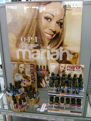
OPI Mariah Carey Collection Spotted

Hi chickadees!

Don't get too excited. I spotted this collection at an Ulta Store at 3010 Bridgepointe Pkwy San Mateo, CA, not in NYC. But I thought I'd share it with you anyway.


I was debating whether or not to get the set but really the only color that intrigues me is Stay the Night. http://pinterest.com/pin/337910778260909931/ I wonder how this liquid sand polish will actually look on my nails. Hopefully these polishes will end up in stores here soon. I'll keep you posted if I find them anywhere.

Wednesday, January 2, 2013

REVIEW of OPI My Pointe Exactly/Piroutte My Whistle

Hello darlings,


It isn't often that I can say that a polish looks exactly the way I expected it to when I bought it. Thankfully, that was the case when I finally paired OPI's My Pointe Exactly with OPI Piroutte My Whistle, a polish and top coat from the NYC Ballet Collection. I was feeling a bit glum about not having snow for Christmas (yes, I know this post is more than a little late) so once I got back from my trip I decided it was finally time for the My Pointe Exactly/Piroutte My Whistle manicure I'd been holding off for so long.

So, firstly I'll start with My Pointe Exactly, which I only wore on its own for a day (long enough to photograph) and then I'll talk more about Piroutte My Whistle.

Color: OPI My Pointe Exactly is a semi-sheer light gray polish. It sounds like it would be horrible but I think it might actually be my favorite of the three OPI NYC Ballet Collection polishes I own (the other two being Barre My Soul and You Callin' Me a Lyre?). Because it's gray, it avoids looking too simple or precious like other sheer polishes. But because it's a lighter color and a sheer polish, it still elongates the look of your fingers.
Formula: The formula is much like that of the other polishes in this collection. It's on the thinner side but for a sheer polish it isn't watery.
Application: Application is also a lot like the other polishes in this collection. The polish applies very smoothly though I do get a bit of balding. It really isn't that noticeable once you've applied top coat and if you're not examining your nails very closely. The polish looks obviously gray in 2 coats. I think you need at least two even if you want a very sheer look. I used 3 coats to get it to a level of gray I was happy with. It isn't fully opaque but I like the semi-sheer look with this polish.
SWATCHES