Hello chickadees,
 Today I'll be reviewing another blue polish for you. I know. I know. You've probably already seen reviews of Essie Butler Please or one of the bajillion comparison posts comparing it to all the other blue polishes including Nails Inc. Baker Street. I'm thinking of doing this peacock nail art look and PolishAholic reports that Baker Street is brighter than Butler Please and from the swatches I've seen, I think it could be the perfect blue of a peacock's body. But I'm not sure that's enough to justify buying a very similar bottle of blue polish. Why am I telling you this? I don't know. On with the review!
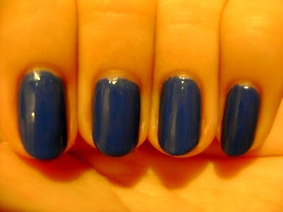
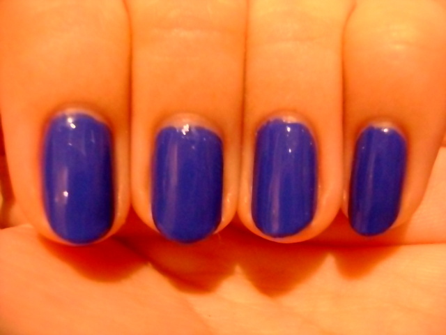
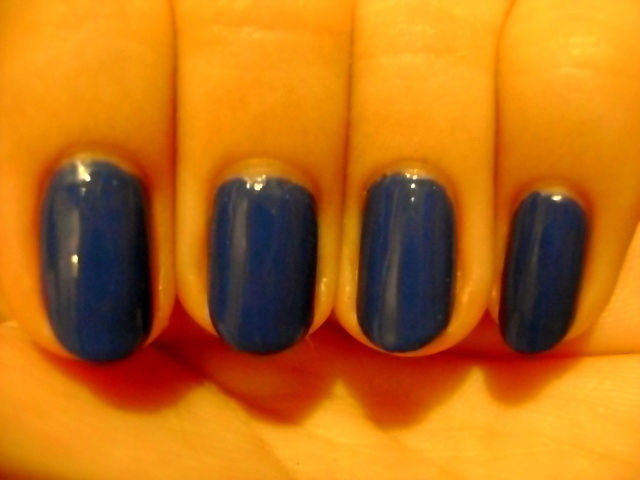
Color: Essie Butler Please is a medium blue creme polish. I think it's just a touch off from what I would consider primary blue. It's a little dustier. I want to say it has purple in it but that's a lie. It just has this look of a primary blue that is slightly faded.
Formula: Eh. See the application section.
Application: Where to begin? OK, let's take this one hand at a time. Painting with my dominant hand, I did a thin first coat on the nails of my left hand. The first coat was smooth but not even. The coat was too thin to really get coverage and the polish applied patchy. The second coat still applied smoothly. I noticed that the polish looked a bit odd at this point. It wasn't drying matte but it wasn't shiny either. I then applied a third coat as the polish wasn't fully opaque. The polish got a little gloopy at this point. I could tell that my nails were not perfect without top coat. It might have been the weird finish but the top coat made the polish look noticeably darker. Painting with my nondominant hand, something happened to the polish. The temperature of the room hadn't changed and I really have no explanation for why this polish lost its mind. The polish got very thick and started threading. What I mean is that as I pulled the brush from the bottle long "threads" of polish clung to the brush. It was very hard to get even coats of polish. The brush started dragging and the polish was a thick, gloopy mess.
Wear: I wore this polish for five days. I was unable to wrap the tips of my nails on my right hand (for obvious reasons) and experienced a tiny bit of tip wear. Also, the polish looked a bit dull. I never refresh my polish with top coat but this might be a polish where you would need to do so to keep it looking shiny.
CONCLUSION: I don't know. This would have just been an OK but not great polish if I had only done my left hand. But for whatever reason it became a mess when I tried to paint the nails on my right hand. It's a nice color but it is dupeable and personally I still have my eye on a brighter color like Nails Inc. Baker Street might be. So I can't recommend this polish based on my experience.
SWATCHES
Because this polish wasn't content with being a pain the arse to apply, it was also a pain in the arse to photograph. So I tried to do something a little different and edit my pictures to get more color accurate results. I know, technologically challenged me trying to edit pictures? That's what I thought. Don't be too impressed. I just downloaded Picasa. First we'll start with the semi-color accurate pictures I manipulated with my mad computer skills and then I'll show you the actual photos I took.


 Now for the original photos...


Color: Essie Butler Please is a medium blue creme polish. I think it's just a touch off from what I would consider primary blue. It's a little dustier. I want to say it has purple in it but that's a lie. It just has this look of a primary blue that is slightly faded.
Formula: Eh. See the application section.
Application: Where to begin? OK, let's take this one hand at a time. Painting with my dominant hand, I did a thin first coat on the nails of my left hand. The first coat was smooth but not even. The coat was too thin to really get coverage and the polish applied patchy. The second coat still applied smoothly. I noticed that the polish looked a bit odd at this point. It wasn't drying matte but it wasn't shiny either. I then applied a third coat as the polish wasn't fully opaque. The polish got a little gloopy at this point. I could tell that my nails were not perfect without top coat. It might have been the weird finish but the top coat made the polish look noticeably darker. Painting with my nondominant hand, something happened to the polish. The temperature of the room hadn't changed and I really have no explanation for why this polish lost its mind. The polish got very thick and started threading. What I mean is that as I pulled the brush from the bottle long "threads" of polish clung to the brush. It was very hard to get even coats of polish. The brush started dragging and the polish was a thick, gloopy mess.
Wear: I wore this polish for five days. I was unable to wrap the tips of my nails on my right hand (for obvious reasons) and experienced a tiny bit of tip wear. Also, the polish looked a bit dull. I never refresh my polish with top coat but this might be a polish where you would need to do so to keep it looking shiny.
CONCLUSION: I don't know. This would have just been an OK but not great polish if I had only done my left hand. But for whatever reason it became a mess when I tried to paint the nails on my right hand. It's a nice color but it is dupeable and personally I still have my eye on a brighter color like Nails Inc. Baker Street might be. So I can't recommend this polish based on my experience.
SWATCHES
Because this polish wasn't content with being a pain the arse to apply, it was also a pain in the arse to photograph. So I tried to do something a little different and edit my pictures to get more color accurate results. I know, technologically challenged me trying to edit pictures? That's what I thought. Don't be too impressed. I just downloaded Picasa. First we'll start with the semi-color accurate pictures I manipulated with my mad computer skills and then I'll show you the actual photos I took.


What?

No.

Failure.

That's not even a little bit close. Why do you hate me?
No comments:
Post a Comment