Friday, March 28, 2014

EXHIBIT REVIEW Fountains of the Deep: Visions of Noah and the Flood

Hello darlings,

It's been a while since I've done an exhibit review. I trekked on over to 462 West Broadway to check out the Fountains of the Deep exhibit that is meant to accompany the release of Darren Aronofsky's Noah featuring Russell Crowe and Emma Watson. The exhibit closes tomorrow but surprisingly it wasn't too busy when I stopped by in the afternoon. I saw a lot of curious people walking by but not a lot of people were going in. The exhibit is open to the public free of cost so if you're interested, I would definitely stop in. It's a quiet, welcoming environment that allows you to form your own opinions about the works presented without the pressure of an academic setting or some artistic authority telling you what is orthodox to admire.

Note: There is one piece towards the end of this post that is NSFW.


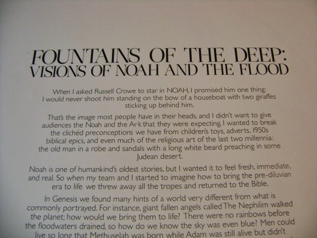
I know there's been some controversy swirling around the film and I thought this was a lovely way of asking people to look at the story of Noah through both the film and the exhibit so I've taken photos so you can read it in its entirety.
I will not be including every piece from the exhibit in this review but only highlighting some of my favorites. This piece from Mike and Doug Starn really needs to be seen in person. Bear in mind that I've never even taken an art history class, but I'll still give you my input because I think that's what this exhibit is asking you to do. I think there's a chaos here that's very interesting. The ark hasn't been deconstructed or destroyed but this piece invites you to see the disorder in the structure and in the story instead of the perfectly constructed ark of popular imagination.
This piece, titled Master Submersion Plan, seems to have the opposite message. It is all order. I felt like I was being asked to look through the eyes of God but it wasn't a familiar Old or New Testament God. This was a God with a technical, almost scientific plan for flooding the world and wiping out almost all the living creatures he had created. For me, the heat map style implied some kind military authority or perhaps a Bond villain.
This was just a lovely piece. I admit it. I have a weakness for aesthetically pleasing art. 
This piece was pleasant to look at but I'm afraid I didn't really take anything away from it. Are the male and female elephants separated from each other?  Why focus on elephants at all? Why create this textured, weathered look while having this very simple ark and the clean, empty look of two elephants entering and exiting? If you have any thoughts, I'd love to hear them in the comments. I do like the style of this painting. It reminds me of the illustrations for children's books.

I do not know who created this piece but I find it fascinating. The way the animals are scattered about this painting almost reminds me of something you'd find at the American Museum of Natural History. The animals almost seem like textbook illustrations. It's interesting that a lot of sea creatures seem to be displaced by the bones which presumably represent the human beings killed by the flood. The umbrella seems to be a rather irreverent way of representing God's protection of the passengers on the ark.

In my opinion, this piece from Michael Bevilacqua was one of the more striking pieces in the exhibit. It felt both literal and abstract. It appears that symbols of the story are adorning this ladder but in spite of that sense of recognition, I'm still unsure of what this piece is trying to communicate.
I take it this flag symbolizes the rainbow after the flood.
And I think the crow was the first bird Noah sent out to look for land. Regardless, there's something captivating and offputting about staring into the eyes of a taxidermied crow. 
I am not sure of the significance of this broken anchor or the fact that it's made of a weak substance like paper.
Peter Som Sample Sale Report March 2014

Hello raindrops,

I know this is rather late in the day to be posting a report for a sample sale that's closing in a few hours but I thought at the very least, it would be good to have this sale for my archives. If you are interested in the sale though, run to 611 Broadway (suite 828) because the sale closes today at 7:30 pm.

UPDATE: Racked NY reports that the sale is reopening for one more day. Today March 31 the sale will open once more at 10:00 am and close at 7:30 pm. Apparently there will be further discounts but I compared the prices they listed and the only change from the prices I have here is that skirts and pants are now $40 whereas before they were $50.


I thought the pricing was fair for a high end designer brand like Peter Som. Of course, as with any sale, there are going to be pieces that are worthy of the prices and those that aren't. Personally, I thought there were enough embellished and well-made pieces to warrant the trip, even though this is a relatively smaller sale. I did RSVP but it was a fairly quiet sale and no one was checking names.
This was the makeshift dressing room they provided in their office. 
All of the garments I looked at didn't have any size labels. If you don't have a good eye for this kind of thing, I'd recommend just taking the chance and trying things on. I would say that like a real sample sale, the sizes run small but it's not like it's all 0's and 2's. I would say 4's and 6's have a chance of finding something that fits at this sale but if you're larger than a 6, you probably won't have much luck.

Clothes are arranged by type so pants, skirts, jackets, blouses, and dresses are grouped in their own sections. When I went by this afternoon the swimwear was almost completely gone.
The skirts were sturdier than I expected them to be. There definitely seemed to be some fall pieces with thick wool and velvet skirts in the mix. 

The skirts were mainly in neutral colors but there were a few standout pieces. There was a beautiful red skirt in what looked like organza but it definitely looked like a 2. 

Thursday, March 27, 2014

REVIEW of Sally Hansen Magnetic Nail Color in 905 Red-y Response

Hello meadowlarks,

No, there's no connection between Sally Hansen Red-y Response and meadowlarks. I've just been listening to the Patti Lupone version of that song nonstop since seeing Stephanie J. Block at Carnegie Hall. #humblebrag #sorryforthehashtag. I don't know if you remember when I reviewed Graphite Gravity all the way back in July of 2012 but although I didn't hate that polish, I wasn't intending on buying another one. Fast forward to... maybe a few months ago (I've stopped doing haul posts all the time so I can't remember exactly when I bought this) but these Sally Hansen Magnetic polishes were on clearance at Walgreens and Duane Reade so I ended up purchasing two colors. I will be reviewing the second one... sometime in the future. At the rate I'm going, it could be another two years.

Color: Sally Hansen Red-y Response is a pink magnetic polish. Like other magnetic polishes, it looks like it's somewhere between a metallic polish and a shimmer in its normal state. Of course, the point of a magnetic polish is to hold the provided magnet over the polish so a design forms. The magnet design of this polish is the same wave pattern as the one that comes with Graphite Gravity. Surprisingly, the places where the waves condense are actually quite dark for a pink polish. I found that this polish also pulled a bit more purple under certain lighting conditions. It was never actually purple but more the distinction between magenta and fuchsia. As with other magnetic polishes, the real selling point is clean, easy nail art, which is what Red-y Response provides.
Formula: This polish has a smooth, fluid formula that is neither too thick or too thin. It does smell godawful though.
Application: This polish has a wider brush, which you know I'm not a fan of, but it didn't create any issues. The polish applies like a shimmer polish with apparent brushstrokes. At one coat, there was good coverage but it was nowhere near opaque so I thought that in spite of the instructions, I might have to apply three coats. But then I applied the second and quickly held the magnet over it and, lo and behold, it did appear opaque at two coats. I should note that in the photos the pattern appears a little less pronounced on the nail of my middle finger because I unintentionally touched the magnet to the nail and had to add a third coat and re-do the design.
Wear: I wore this polish for four days without top coat and then applied top coat on the fourth day to finish taking photos for this review. In those four days I experienced a little bit of tip wear. I would say this polish holds up better than Graphite Gravity but I'm not sure how it would survive past day four.

CONCLUSION: If you like the magnetic polish look, I'd totally recommend this polish. Application is easy. The design shows up cleanly without any issues. The only drawbacks are the smell and possibly the wear time.

Cat is a participant in the Amazon Services LLC Associates Program, an affiliate advertising program designed to provide a means for sites to earn advertising fees by advertising and linking to amazon.com. If you would like to help support this site, please consider making your next purchase at amazon.com through the links on my page. I will get a small percentage of anything you purchase through one of my links at no extra cost to you.

SWATCHES

Tuesday, March 25, 2014

REVIEW of Zoya Odette With SWATCHES

Hello my lovely cygnets,
I didn't think I was going to have a chance to bring that back after my Orly Lucky Duck review but then I got Zoya Odette in my February ipsy glam bag. Odette was released as part of the Zoya Naturel collection which, let's be honest, didn't make much sense. It was bad. It was a bad collection. Odette is not a color I would have chosen for myself and I ended up having mixed feelings about it. After that stunningly compelling tease, let's get into the actual review.

Color: Zoya Odette is a dusty red-toned purple creme polish. I would describe it as a very dry color. It's muted without being dull. As a purple, I'd say it sits in that space between the light lilacs and lavenders that get released in the spring collections and the rich and dark purples that get released in the winter collections.
Formula: Zoya Odette has a thinner formula.
Application: The formula is very fluid and liquid-y. The first coat went on smoothly though it was noticeably thin and sheer. The second coat glided nicely without drag but I did have to even out the polish with the brush. The polish was actually mostly opaque at two coats but because of the unevenness of the application, there were lighter patches. At three coats, the polish was opaque but again I did have to even it out. Examining the polish afterwards, I did notice there were still patches where the polish wasn't fully opaque.
Wear: There was noticeable tip wear on the first day I wore this polish even though I wasn't doing anything particularly manicure-damaging with my hands. I wore this polish for five days and experienced more tip wear in that time. I seem to be having a bad run of luck with Zoya with Ray and now Odette.

CONCLUSION: I think the color is fine but I'm not in love with it which is to be expected when you don't choose a polish for yourself. You do have to even out this polish and while it is manageable it isn't ideal. Those two factors lowered my opinion on this polish but with the poor wear, I just find it difficult to recommend this polish.

Cat is a participant in the Amazon Services LLC Associates Program, an affiliate advertising program designed to provide a means for sites to earn advertising fees by advertising and linking to amazon.com. If you would like to help support this site, please consider making your next purchase at amazon.com through the links on my page. I will get a small percentage of anything you purchase through one of my links at no extra cost to you.

SWATCHES

Friday, March 21, 2014

March Ipsy Glam Bag

Hi peanuts,

I have a terrible headache right now. I think it's from the cold. I forgot to wear a hat when I went outside this morning. And before you say it, yes, I know I skipped February. The moment has passed. The Zoya Odette review is coming soon. Now, on to the March ipsy glam bag.

I like the design for the March ipsy glam bag. I probably wouldn't gravitate to this kind of design on my own but it's a nice alternative to a solid color and I do like the rubbery synthetic material from which it's made. Cloth bags are nice but these are easier to clean.
One thing I'm pretty happy with when it comes to ipsy is that they seem to have realized that I'm a polish girl as I get a bottle of nail polish in almost all of my glam bags. This month there were only 4 items but they were all full size items which is great except for when you force those deluxe items into the same packaging you use for small items and the packaging gets crushed.
I'm guessing this Nicole by OPI Rougles polish won't be my style but it's a nice color for spring and summer and I'm willing to give it a shot.
I also got the cutest little lipstick from Bare Minerals. I already have a ton of lip products to test so I'm not that bothered that this is a smaller sample since it's so freaking adorable.

Thursday, March 20, 2014

Joy Gryson Tribeca

Hi chickadees!

As I mentioned in my sample sale report, all the regular merchandise at the Tribeca Joy Gryson store will be discounted 10% during the sale. If you somehow can't find anything you like at the sale, I've taken some photos of what you'll find among the full-priced merchandise. As with the sample sale, you'll find a wide range of styles and colors among the regular merchandise in the store. Happy shopping!


Joy Gryson Sample Sale Report March 2014

Hello darlings,

I am just back from the Joy Gryson Sample Sale being held at Tribeca storefront at 106 Franklin St between Church St. and West Broadway. The sale started today March 20 at 4:00 pm and will run until 8:00 pm. Tomorrow March 21 and Saturday March 22 the sale will open at 11:00 am and close at 7:00 pm. Sunday the sale will open at 12:00 pm and close at 6:00 pm. There is no coat or bag check and both cash and credit will be accepted though credit cards are preferred.

The sample sale is being held in a large room at the back of the store past the cash register but all the regular merchandise in the store is also discounted 10% during the run of the sale. I'll put up a separate post shortly with photos of the regular merchandise. Now, onto what you came here for.

Pricing is pretty fair at this sale. I'd say that the majority of items are $100, followed by $200 items. The $300 bags were largely specialty items. There are also some items priced at $50 but the selection wasn't as great so if you're planning on going for the $50 items I wouldn't leave it to the last day. Most of the bags have a small ribbon attached to the strap denoting the price though there are some bags with written tags. Essentially, if you can't find a ribbon then go by the price on the tag.
This is a very photo-heavy piece. Let's begin with the wider shots and go into the close-ups at the end. This is back wall closest to the entrance. Here you'll find a lot of the $200 green ribbon bags which are generally a bit larger than the others. There are also a few $100 white ribbon bags in this section.

The adjacent wall also features many of the $200 green ribbon bags.
You will find a lot of white ribbon $100 bags in the middle of the showroom. 

Now, here is where you'll have to rifle through the bags a bit. The rightmost wall and the back wall furthest from the entrance have a large assortment of styles at different price points. You're more likely to find a more unusual bag in these sections.
Behind the glass table you will find another table surrounded by the $50 bins, some of which contain the bags Joy Gryson manufactured for Nanette Lepore.
$200 green ribbon
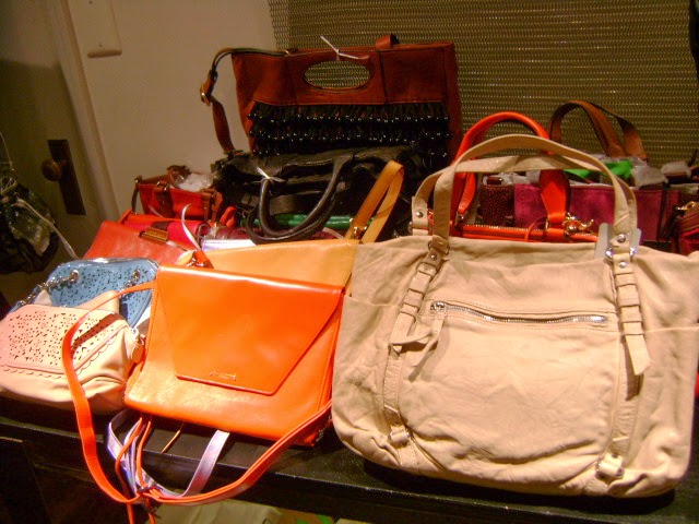
This table had a mix of $100 and $200 bags. I particularly liked the flat cross-body bag that appears bright orange in this photo. It's actually red.