Hello darlings,
It's been a while since I've done an exhibit review. I trekked on over to 462 West Broadway to check out the Fountains of the Deep exhibit that is meant to accompany the release of Darren Aronofsky's Noah featuring Russell Crowe and Emma Watson. The exhibit closes tomorrow but surprisingly it wasn't too busy when I stopped by in the afternoon. I saw a lot of curious people walking by but not a lot of people were going in. The exhibit is open to the public free of cost so if you're interested, I would definitely stop in. It's a quiet, welcoming environment that allows you to form your own opinions about the works presented without the pressure of an academic setting or some artistic authority telling you what is orthodox to admire.
Note: There is one piece towards the end of this post that is NSFW.
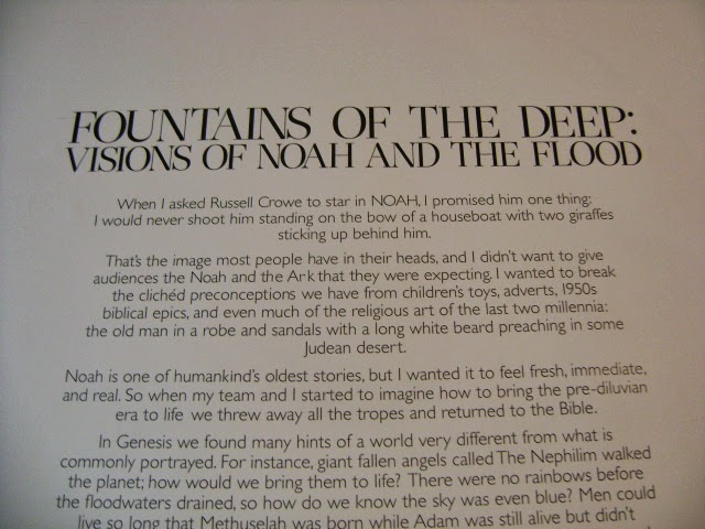
I know there's been some controversy swirling around the film and I thought this was a lovely way of asking people to look at the story of Noah through both the film and the exhibit so I've taken photos so you can read it in its entirety.
I will not be including every piece from the exhibit in this review but only highlighting some of my favorites. This piece from Mike and Doug Starn really needs to be seen in person. Bear in mind that I've never even taken an art history class, but I'll still give you my input because I think that's what this exhibit is asking you to do. I think there's a chaos here that's very interesting. The ark hasn't been deconstructed or destroyed but this piece invites you to see the disorder in the structure and in the story instead of the perfectly constructed ark of popular imagination.
This piece, titled Master Submersion Plan, seems to have the opposite message. It is all order. I felt like I was being asked to look through the eyes of God but it wasn't a familiar Old or New Testament God. This was a God with a technical, almost scientific plan for flooding the world and wiping out almost all the living creatures he had created. For me, the heat map style implied some kind military authority or perhaps a Bond villain.
This was just a lovely piece. I admit it. I have a weakness for aesthetically pleasing art.
This piece was pleasant to look at but I'm afraid I didn't really take anything away from it. Are the male and female elephants separated from each other? Why focus on elephants at all? Why create this textured, weathered look while having this very simple ark and the clean, empty look of two elephants entering and exiting? If you have any thoughts, I'd love to hear them in the comments. I do like the style of this painting. It reminds me of the illustrations for children's books.
I do not know who created this piece but I find it fascinating. The way the animals are scattered about this painting almost reminds me of something you'd find at the American Museum of Natural History. The animals almost seem like textbook illustrations. It's interesting that a lot of sea creatures seem to be displaced by the bones which presumably represent the human beings killed by the flood. The umbrella seems to be a rather irreverent way of representing God's protection of the passengers on the ark.
In my opinion, this piece from Michael Bevilacqua was one of the more striking pieces in the exhibit. It felt both literal and abstract. It appears that symbols of the story are adorning this ladder but in spite of that sense of recognition, I'm still unsure of what this piece is trying to communicate.
I take it this flag symbolizes the rainbow after the flood.
And I think the crow was the first bird Noah sent out to look for land. Regardless, there's something captivating and offputting about staring into the eyes of a taxidermied crow.
I am not sure of the significance of this broken anchor or the fact that it's made of a weak substance like paper.
For a painting in what was essentially grayscale with hints of blue, I thought this was quite beautiful. I think the ark is meant to be perched on the waves (though I never attended Bible study) but the way this painting depicts things, it almost echoes that idea of a city on a hill. I like how that is countered by the man walking his dogs which feels charmingly mundane.
This tree of life/family tree drawn in the style of a phylogenetic tree was easier to understand but no less thought provoking. I have included a lot of close ups so you'll actually be able to read the words.
I don't have anything interesting to say about this piece but it was pretty and colorful.
I appreciated the inclusion of some comic book artists though I don't read comics myself. The graphic style is very striking and I think they immediately read as the work of comic book artists before you even see the names. Though I don't find the stories of conflicted great men that compelling, this is a beautiful piece of artwork.
Even with my cursory knowledge of comics, I know that Rob Liefeld has his share of detractors but I liked this piece. Noah and this group of "protected" animals had such aggressive expressions. That aggression reads as masculine to me which of course makes me wonder, where the women are in this vision of the story of Noah. It also seems at odds with the children's book illustrations of smiley animals.
Speaking of children's books, I love this piece from Jim Torok. It captures a child's perspective really wonderfully. I wish I could find the name of the Goliath book I reviewed a while back but this reminded me of the whimsy and honesty of that book.
I have a fondness for simple graphite and charcoal sketches.
I may be interpreting this incorrectly but to me it seemed like what the world would look like from a window on the ark. This is another one of those pieces that you should really see in person.
I think this had the clearest environmentalist message of all the pieces in the exhibit though I still feel like there were parts of this painting that escaped me.
I am not sure why this Noah is bleeding from his mouth... unless he's a vampire, but I liked that this seemed to channel a different (non-Western) artistic tradition.
Honestly, I have no idea what this is getting at but I kind of love that such a risque piece came from a female artist. I was drawn to this sketch from Anna Gaskell because it reminds of me what I call a "high school" style of sketching and then after a few seconds I realized how naughty it was and I was amused. I can't imagine that this is supposed to be taken seriously. It's not really "sexy." If anything, the animals seem bored. Is it meant to challenge the idea of pairs of male and female animals of each species? Is it commenting on the lack of other sexual identities or the allowance of sexual activity for non-procreative reasons? Is it just what Anna imagines the animals did on a cramped ark with nothing else to do? I don't know. But the artwork is solid and it made me think, even if I went off in the wrong direction. By the way, this is the NSFW piece.
I am not sure what this piece is supposed to represent. Remember, I didn't go to Bible study. But I think the dove was the second bird sent out from the ark. I suppose this might be another artist providing a sobering reminder that in this story of rainbows and the chosen few that were saved, many other lives were lost. The choice to depict two figures embracing suggests people not on the ark who were capable of love and the instinct to shelter and protect one another in the face of inevitable death. And I think it's striking that they're not just sheltered from the waves but from "God's light" in this painting. However you choose to interpret this, I have a weakness for watercolor and I think this painting is just gorgeous.
I have no idea what this vision of "Building the Ark" is meant to convey but I was drawn to this painting. It seemed like a vision of an alien planet from a fantasy novel.
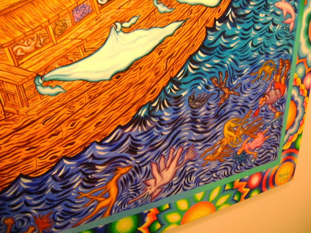
This painting from Barbara Mendes seems to juxtapose the typical children's Bible illustration of Noah and his family in brilliant colors with a reminder of the animals and people killed in the flood.


No comments:
Post a Comment