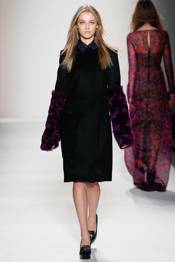
Honor
Image Credit: http://nymag.com/fashion/fashionshows/2012/fall/main/newyork/womenrunway/honor/?mid=380015&rid=422688775
This look makes it to this list because I find it completely inexplicable. This is Brittany's arm warmers (Glee) taken to a whole other purple furry level and paired with a basic, conservative secretarial outfit. Why...? No, really. Why?
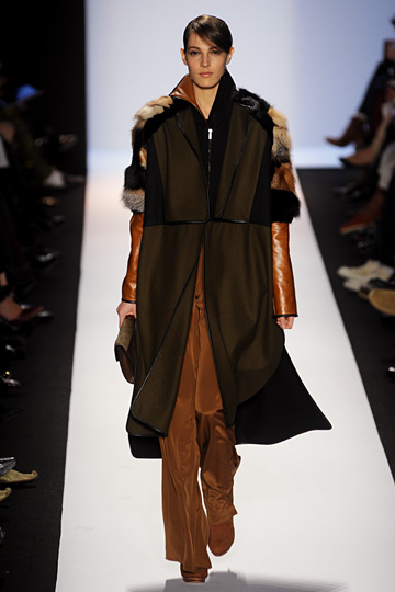
BCBG Max Azria
Image Credit: http://nymag.com/fashion/fashionshows/2012/fall/main/newyork/womenrunway/bcbgmaxazria/#slide18&ss1
I love BCBG Max Azria. Many pieces in my closet are from BCBC Max Azria. But they look nothing like pieces in this most recent collection. In color scheme if not in design, it had a Native American vibe dominated by tan, brown, and primary red, blue, and yellow. There were strange sheer panels and loose-fitting, unflattering sacks. I chose this look because the model looks like a monster. Some strange broad-shouldered furry, leather, suede hybrid creature a la the platypus.

BCBG Max Azria
Image Credit: nymag.com
Put aside the garish blend of colors and the awkward styling choices. Why is wearing that oversized fur like a recent kill and what is with the strange sheer panels and their placement in the skirt? She looks like she fell into a paper shredder and then taped the pieces back together.
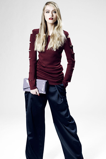
Z Spoke by Zac Posen
Image Credit: http://nymag.com/fashion/fashionshows/2012/fall/main/newyork/womenrunway/zspoke/?mid=380015&rid=422688775#slide14&ss1
This look is just lazy and disproportional. Why the cutouts on the sleeves? What do they accomplish? Why all the excess fabric in the stomach? Why the wide-legged pants with draping if the model has such a slim torso? Heck, why wide-legged pants with draping regardless of what shape a woman is?
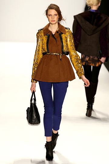
Rebecca Minkoff
Image Credit: http://nymag.com/fashion/fashionshows/2012/fall/main/newyork/womenrunway/rebeccaminkoff/#slide17&ss1
Like the arm warmers, the brown top is throwing everything else off? Why this color combination? Why the oversized collar? Why the sad billowy mushroom shape? Who would look good in this outfit?
Cynthia Rowley
Image Credit: http://nymag.com/fashion/fashionshows/2012/fall/main/newyork/womenrunway/cynthiarowley/?mid=380015&rid=422688775#slide2&ss1
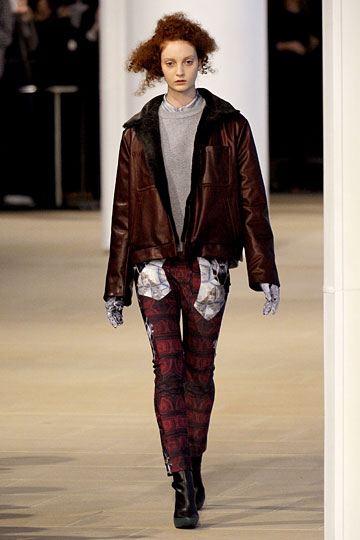
It was difficult to choose just one look from Cynthia Rowley, but I bypassed odd design choices and merely boring and unflattering looks to choose this one. Why? Because no one should design an outfit like this. This is the kind of outfit you pull together after spending $20 between thrift stores and the Salvation Army and patching up the holes. Nothing about this look works. You can't draw out one good stand alone piece. The color combination is drab and unflattering. The cut and design of every piece is drab and unflattering. I don't know how a look like this makes it down the runway. I don't even know how it makes it past the initial sketch.
Jil Sander
Image Credit: http://nymag.com/fashion/fashionshows/2012/fall/main/newyork/womenrunway/jilsandernavy/?mid=380015&rid=422688775#slide10&ss1
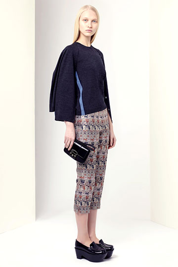
I simply find this look depressing. The strange, wide, folded sleeves that make the model look like a flightless bird. The shapeless top. The odd blue stripe. The terrible pattern and the weird length of the pants. The platform loafers. Sigh...
No comments:
Post a Comment